Unread Email Appearance

Hi! Does anyone know of a way to change the appearance of unread emails in the inbox. The bolded text and dot do not really stand out enough for me to make this obvious, and I’d prefer not to have to flip back and forth between the full inbox and the unread email inbox. Ideally, I’d be able to change the color of unread emails in a way similar to how the active email is highlighted in the mail list (e.g. make them a light blue or something similar).

I love EM Client in almost every other way, but this is a big negative for me.

Thanks!

9 Likes

Have you tried the dark theme with the orange dot for unread?
If I have a bunch of unread emails sprinkled throughout the folder, I click on the column with the orange dot, and they all consolidate to the top of the list.

Not sure if this suggestion is of interest, but it works well for me.

Hi @sunriseal I appreciate the suggestion, but the orange dots are really not doing it for me. I’m just looking for a way to make unread emails (or those marked as unread) painfully obvious, without having to re-sort or flip between boxes. During a typical workday, I’ll often mark an email that I’ve read, as unread, if there is some outstanding action required from me. This is much more efficient for me than creating tasks, etc., and gives me a decent synopsis of my day at a glance of my inbox (e.g. the ratio of read vs. “unread” emails, and where they are in the timeline). This is a system that has worked extremely well for me over the years.

The best way to make unread emails obvious that I have seen, is to have them bolded, with an alternate text colour for the subject line, and/or then the whole thing shaded a different color in the inbox. With all of the mail settings available in eM Client, I was surprised that there was not an “unread mail” category in mail preferences to allow for these sorts of end-user personalizations. And having looked through the forum a bit more after making my submission, I see that I’m not alone in this request. I could also see that eM Client’s design team seems to be responsive to feature requests (and this one should be pretty straightforward to do - low hanging fruit as some might say).

I guess I’ll have to hope for the best on this, but because of how I use unread email and how little the current themes and settings allow me to distinguish them, this will likely be a deal breaker for me from moving into the paid version after the trial. The lack/subtlety of distinction for unread emails just makes it too likely I will miss something, and I can get this feature in other offerings (though they are not as good in some other ways). It’s a shame, because I love everything else about eM Client so far.

5 Likes

@Kev1n

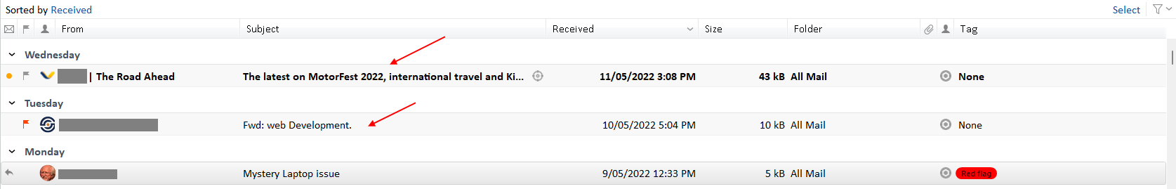
It will do do with the Theme you are running as @sunriseal advised. I have no issues in any of the supplied eM Client built-in Themes showing the difference between Read and Unread emails. As you can see below Unread is very clear in Bold compared to the Unread messages below.

(eM Client V9 Classic Theme example).

If you need help with Modifying Themes in the Theme Editor or other Theme Editors manually see the following eM Client links. Lots of experienced Theme editor peeps on these threads.

[Custom eM Client Themes - eM Client](https://forum.emclient.com/t/custom-em-client-themes/36440

[Editing Theme Source Code - eM Client](Editing Theme Source Code - eM Client)

Hi @cyberzork I appreciate the reply, but I am very comfortable switching themes and the current appearance of unread emails in the inbox. None of them do what I have asked for (change the colour of the subject line and highlight the colour of the unread email in the inbox), to make the unread emails stand out in a way that is painfully obvious. While you may find the current distinction obvious, I don’t (nor do the others who have asked for this feature). As indicated previously, it is relatively subtle to my eye, and as such requires a deeper diversion of attention (more than a quick glance) to see and interpret which emails are or are marked as unread. So, it is unsuitable for my needs in its current form, for all of the reasons previously indicated. Hence the feature request.

Now, maybe if they had the little red arrows you had to draw in your screenshot to point out which ones were unread… :slight_smile:

5 Likes

I’m new to eMclient and I agree that unread mails just don’t “pop” enough.

In a list of mails my eyes don’t see the unread mails immediately, its like I have to look for them instead. Maybe its because I’m not used to using the app yet, but I beleive its something that could be improved.

image

An option for a different colour instead of just bold?

4 Likes

They do have the unread dot next to them:

1 Like

I hope this is not profanity here, but Outlook with its different coloured subject makes it easier to see unread mails.

image

This could be a “get used to the new app” thing, but also everyone is wired differently and maybe I’m one of the guys that can’t click with the subtle theme.

An option to change text colour based on unread status would be a great thing :slight_smile:

6 Likes

I must be one of the “wired differently” people. I loved the app, but this was a deal breaker for me. I kept losing track of new emails (I am inundated on a daily basis).

I think it’s compounded by the fact the unread email dot is the same color as the subject line, vs. bright blue, bright red, bright green, etc., to really make it stand out at a quick glance. Instead, it’s like it is “camouflaged” to blend in with everything else by being the exact same color.

Some suggestions…

  1. Let the user select alternate dot colors (the dots that mark unread emails)
  2. Highlight unread emails in the inbox
  3. Change the color of unread email subject lines in the inbox, as lazynooblet suggested.
  4. Some combination of the above.

It would be great if these could be set as end user preferences, but I’d settle for just the different coloured dot. I’d come back and give it another try if this issue could be dealt with.

4 Likes

I just started using eM and wanted to +1 this suggestion. It’s driving me crazy. It’s so difficult to tell the difference between read and unread emails (at least in a dark theme like the screenshot above). The dot just gets completely overshadowed by the sender avatars such that it’s very difficult to even notice (at least for me).

Like, any way to change the color of the subject line separate from other lines, maybe the font size, etc would be a huge improvement IMO.

2 Likes

Same here, +1 for this simple request. Unread emails don’t stand out enough. I want to assign a different foreground color to them. In Postbox, you can set rules that assign a color label based on conditions, but that doesn’t seem possible in EMC :disappointed:

1 Like

Is there any chance we will see anything like this? For me it is also a deal breaker and a pity. I was really enjoying the trial, but my eyes hurt from trying to understand whats read and whats unread. The orange dot is not noticeable enough. The bold fond either.
There are apparently plenty of people complaining about this. So it cant be having eye sight problems.

Also there is a reason the posts about this have a lot of views. most people will google for a solution and give up. not many will create an account and post here.

1 Like

I’m also having trouble seeing which emails are unread. It needs to be very obvious at a glance

1 Like

How have people found this over time. I’m just trialing EMClient as well. I’m extremely impressed with the features it has, and I’m so grateful for an alternative to MS Outlook that can actually complete yet work with exchange servers, but I’m really struggling moving across. At present I am running both, and looking at MS outlook simply to make sure I don’t miss any emails that I haven’t read - which is not ideal.

I was just wondering for those who did find this feature missing if over time they got used to no longer having a different color for unread emails, and if it got better?

I changed theme to one that helped a bit. you can also sort unread emails first. I think over time you also get used to it. I have ended up buying the lifetime version and moving over from MS. hopefully one day they will improve this one feature.

I entirely agree. This is literally the only thing keeping me from switching to eM client.

1 Like

+1
I second everything what has been said here. I like the eM Client functionality, but I don’t like using eM Client because of this UI issue. That’s why I still prefer mac Mail on mac and Postbox on Windows.

Avatars and dark mode (two things I like) make it even harder to distinguish read and unread messages. The small dot doesn’t suffice for my brain to process my inbox with a quick look.

I very much like the idea of different background for unread messages:

1 Like

This is planned for the upcoming version 10 through Theme editing.

You will be able to change both the text and/or background colours of unread messages to make them more visible.

So you can be creative for example with backgrounds like this:

Or something more subtle like this:

5 Likes


I’m struggling to add this to themes, any assistance would be greately appreciated.