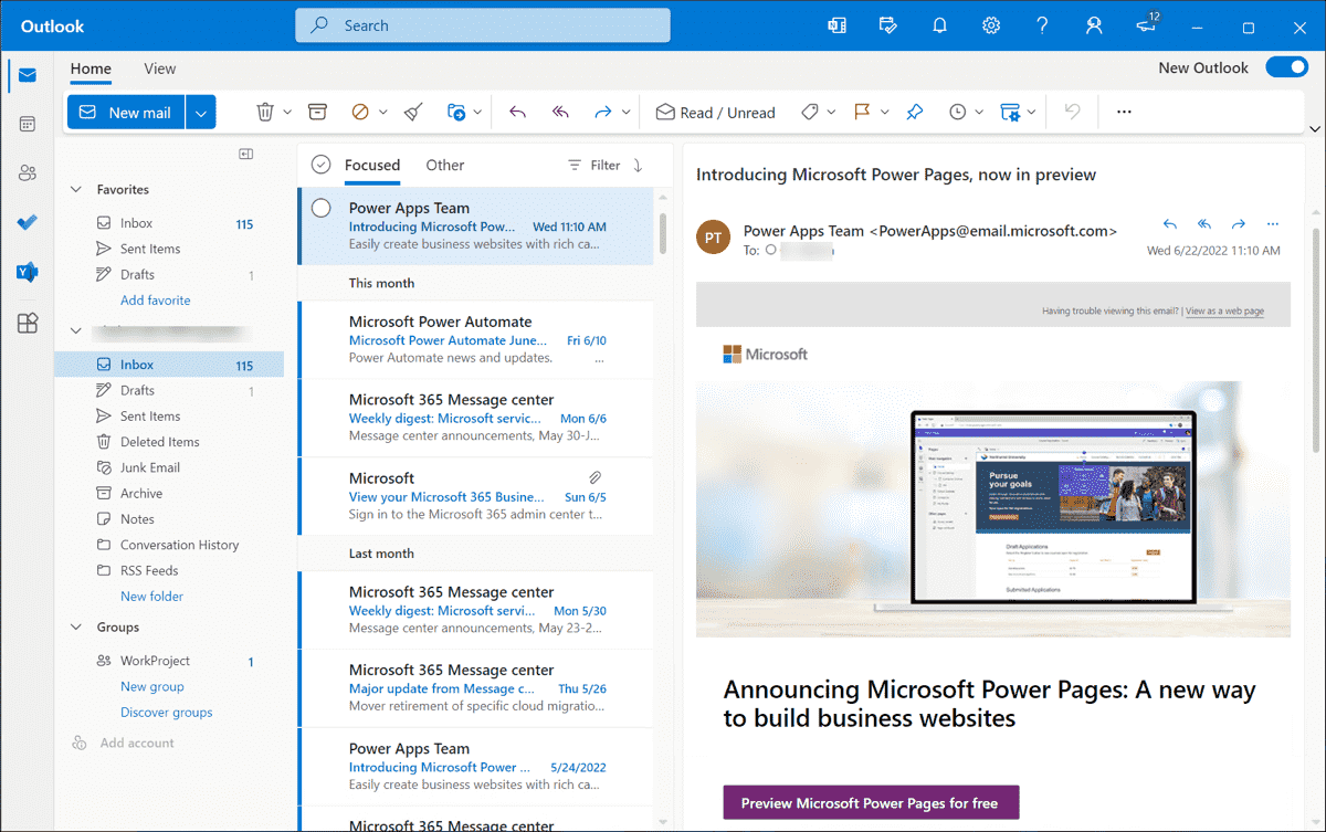
I’m not sure how to call this, but I want to believe that this search bar can be disabled or moved on right corner as it used to be and was perfectly aligned !!!
What kind of thing is this in 10 version I do not understand !!!???
Yes, I also was frustrated with the new search bar (once I finally found it) It just makes our visible screen smaller. It should go back to the right where it was. If things are not broke don’t fix them.
Agreed. This search bar is useless in the centre of the screen. It should go back to the right hand side for desktop PC’s
The search bar was moved in V10 to the centre as per “was requested by the majority of users” where alot came from Outlook where it also has the search bar in the top centre position.
I personally was also an Outlook user and “do like the center area for the search field in eM Client” rather than stuck over over on the right.
(Outlook Paid version)

(Outlook Free new version)
And where was this decided? Didn’t see any email or poll within the app. What about the people that didn’t get to voice that they like the search where it was on the right?
There was many eM Client forum threads on this subject.
There is also a new open suggestion on this subject on the eM Client Sleekplan Share Ideas and Voting page that has alot of user feedback on this topic, where you can certainly put your comments in for what you want.
Still doesn’t answer the question. Not everybody comes to the forum, I just signed up myself. So what now if we get a bunch of new forum threads asking to get the search to the right? Why not code it to give the option to choose the location of the search bar.
Still doesn’t answer the question. Not everybody comes to the forum, I just signed up myself
Put your suggestion in the Sleekplan link in my previous post above on what you want.
Who knows eM Client might down the track make the search box eg: moveable L or R in Settings, but for now it’s in the top centre which I guess is a happy medium to then suit most users.
Ps I am guessing Microsoft also had alot of user feedback on left or right etc and ended up just in the centre which then also suits most users.
My friend all this is ***** let’s assume you had those request which I believe are definitely not the majority of users, AND IF YOU REALLY WANTED TO MAKE IT FAIRE YOU SHOULD USE MAIL CLIENT TO DELIVER VOTING POOL TO EVERY USER SO WE CAN VOTE, ALSO YOU COULD ADD THIS MIDDLE BAR SEARCH AS AN OPTION IN SETTINGS SO WE CAN TICK FOR NEW DESIGN OR CLASSIC SEARCH BAR !
AND IF YOU REALLY WANTED TO MAKE IT FAIRE YOU SHOULD USE MAIL CLIENT TO DELIVER VOTING POOL
Well that’s why eM Client recently created the Sleekplan Share ideas and “Voting” page which is designed for “All users then to vote”.
So suggest you vote for what you want.
How about this option ?!?
You know, I’ve noticed one strange pattern to all big names !! The bigger they became, the worst service they provide and more and more horrible decisions they make ! At least this is my experience !! I have 2 years using your email client and STILL NOT CONVINCED TO PAY FOR LICENCE OR NOT !! And I get more disappointed !!
I think there needs to be an option on the location of this search box.
So I’d think that this should be configurable. I’d much prefer to have the search bar on the right side where it was. If you like Outlook, you can use Outlook, this is eM Client. Which is better. ![]()
I use a 16:10 monitor so vertical space is at a premium and I have tons of horizontal space. I agree that search is now out of place, and I find I really have to look for it. I would love to be able to move/dock widgets anywhere if possible, like how visual studio works.
The search box moved to the title bar, so it doesn’t change the use of vertical space. But what it does is allow you to add more buttons horizontally in the toolbar, since it moved out of the toolbar freeing up that space.
ahh I see that now looking back at v9. I guess my request for a dockable panel would allow all of it to be consolidated into one area which would save vertical space. The titlebar is very underutilized compared to modern browsers and outlook.
We do this the same as MS Outlook.
Well, my usage of outlook has other stuff up there, mostly user assignable toolbar items.
I am saying the ability to drag/drop would allow for this. Right now, my search looks pretty lonely lonely on emclient and there are 8" inches of horizontal space to the left and right of search.
I am saying the ability to drag/drop would allow for this. Right now, my search looks pretty lonely lonely on emclient and there are 8" inches of horizontal space to the left and right of search.
Yes agree would be good if eM Client Devs could utilise those spaces for toolbar items as well.


