Lol. Besides it taking up another line on the screen, why would Em Client want to imitate Microsoft Outlook of all apps.
2 Likes
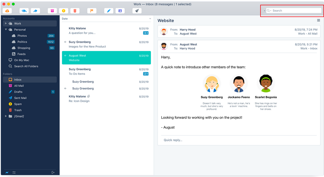
Why would you want to do same design like other software ?!?! And if you really believe this is a good thing then no problem, make it as an option !! But you’re still pushing your idea and enforcing Outlook design to all of us !!! ![]()
![]()
![]()
![]()
![]()
![]()
![]()
2 Likes
Exactly. I can’t see why a good piece of software wants to start imitating a crappy piece of software. I started using EmClient because Outlook is horrible. As for allowing more vertical space for more buttons…less is more. The more you have, the less you end up using them. Glad it’s not only me that thought the move to the top middle space was a bad choice.
3 Likes
Related, to the position of the search box, I tried the (Windows) keyboard shortcut Shift-CTRL-F but that only brings up the search dialog box and I still need to grab the mouse to select a field to enter any search criteria. It would be nice to have a keyboard shortcut to the search box so hands can stay on the keyboard without needing the mouse, then it won’t matter where the search bar is located. In PostBox it was a CTRL-K if I recall to get into the search box, hands stayed on the keyboard.
I see dev. doesn’t give a s*** about our opinion !! still no any answer about this issue !!! ![]()
![]()
![]()
![]()
I see dev. doesn’t give a s*** about our opinion !! still no any answer about this issue.
Of course eM Client does look at user feedback and do read the forums and sometimes posts, but it’s all about what the majority of users wanted, and also what users vote for as well. Currently most users “did want the search field moved from many previous forum thread posts”.
Also as @Gary advised further up moving the search bar to the centre “then allowed you to add more buttons horizontally in the toolbar”, since it moved out of the toolbar freeing up that space.
The only other way to get more horizontal buttons “to view all at once” would have been to eg: have multiple rows of horizontal buttons “as I suggested”, but then that would take up more vertical space, which then wouldn’t be good for alot of users who have low res screens.
So as you don’t like the centre search, there is a Sleekplan suggestion to have the search field customisable eg: Right or Left which you can vote for if you want that as an option. So if you haven’t voted yet, then suggest to vote there.
I see 3 people there with me !! I don’t get it maybe I’m stupid or f*** knows but if you will make an option in setting to have new view or classic for search bar you wouldn’t need this voting !! I’ve noticed a tendency of some nice program getting worse in worse by time !! I’m not sure why !!!
if you will make an option in setting to have new view or classic for search bar you wouldn’t need this voting !!
eM Client won’t just put options in like that unless there is enough users who also want that. So that’s why the Sleekplan voting page has been setup.
I already understand that you broking something good just because someone want that instead to add as a option !! from the beginning ! but apparently this is too complicated for you !! the more time goes the more I’m disappointed in your app !!!