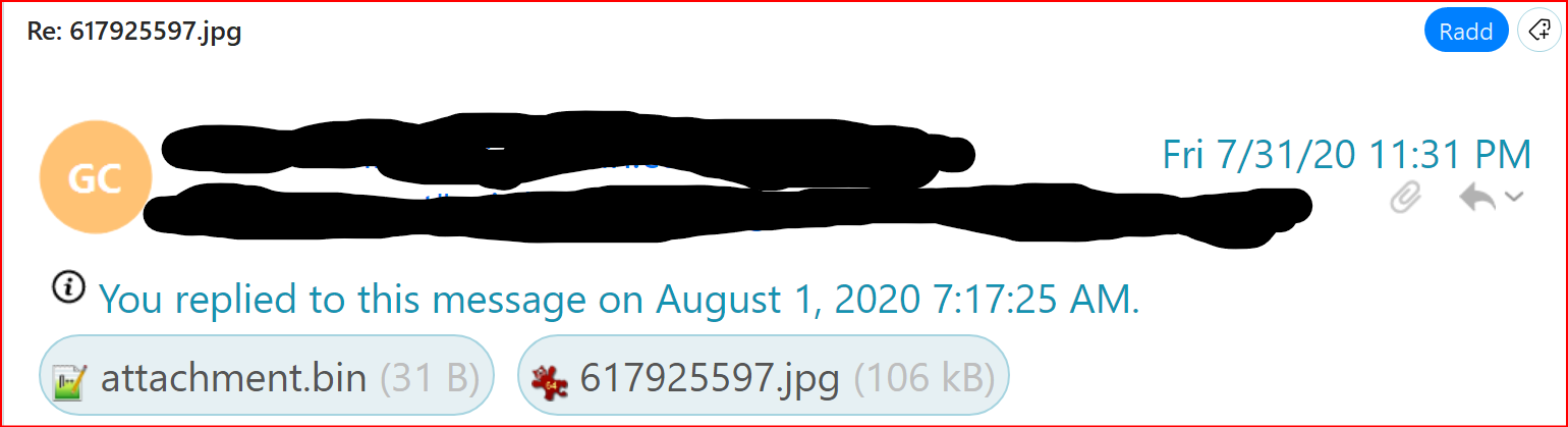
Looking at the main email window toward the top I have the list of emails received, below is the information header and below this header is the content of the selected email body.
The header especially when it contains an attachment takes up 1/2 the available main window. As well this header is just showing most of the exact same information that you already see in the email list just above so it’s totally redundant.
1] Is there a way to eliminate this header?
2] If not…is there a way to reduce the header font size by the registry or theme file or any other means?
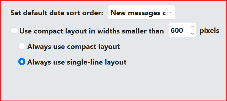
Thanks for your reply but I already use single line layout.
It doesn’t come out as an single line as you can see it’s actually a multi-line.
This is the area between email list and email body content.
I see now what you’re referring to. I prefer to have messages on the bottom so I can see some of the content of each selected email but with it comes a huge header just above that takes up lots of window space. If I select messages panel off then all I see is the email list with no content of any of the selected emails and so I would be force to pop open all the emails I want to preview.
Thanks for explaining the options but I’m stuck with it as is unless I can find a way to modify the theme files or others.
Terminology is critical when conveying the issue… “force to pop open all the emails” to me is a small price to pay (if any) to present me a clutter-free palette.
I moved away from your layout years ago (with several different email apps). As to modifying themes, that is possible depending on whether they contain code affecting the areas you want to change. But it is my guess you will remain “stuck”… Good luck…
I’ve done in the past some theme moding, colors, font size, etc. I don’t recall being able to change the actual header size though.
Yes with the options presented it becomes a trade off. Personally I like the preview screen showing the content. If I find a way to change the header size I’ll post back…thanks for your time.
I noticed, that V8 deals rather generously with space for headers and the like. Which is nice from an aesthetical point of view, with all the items neatly separated and big readable fonts, but does not take quite into account, that space is a rare commodity on a laptop.
We can modify a lot of design features, font sizes and the like, but AFAIK your mentioned problem cannot be solved userwise.