Hi there,
is there an option to color new EMails? Not! color over categories/rules. Simply color new EMails in the inbox.
Greetings
Hi there,
is there an option to color new EMails? Not! color over categories/rules. Simply color new EMails in the inbox.
Greetings
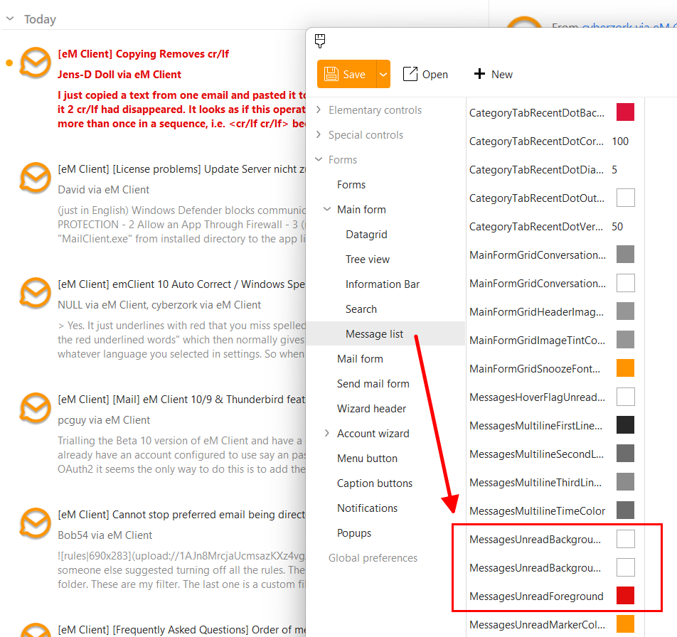
For anyone who is interested, these are the three lines that affect the unread messages:
As you can see I set the foreground option to red, so unread messages will be displayed in red text.
The two options above that are for the background. So if you want a different background colour, set your preferred option there:
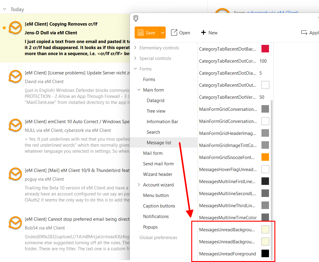
I don’t get all those options in the message list. In particular, the three you have highlighted.
Same predicament. Where do you access all those settings?
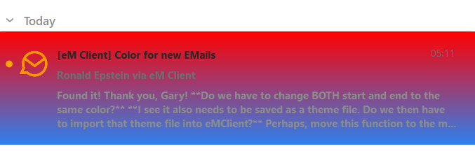
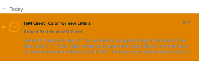
Found it! Thank you, Gary!
Do we have to change BOTH start and end to the same color?
I did change BOTH start and end with a blue color. Saved and imported as a theme.
Problem is, the blue color does not stay exclusively to unread mail. I am assuming that I should have only changed the START color but want to confirm with you.strong text
It is a gradient background. In this screenshot, I have set very different start and end colours. So start red, end blue:
Here the start and end are set to the same colour:
Oh, Wow. That is so cool! Going to try that right now. Thank you, Gary, for explaining how that works!
I wanted to come back here and offer some thoughts on changing the color of unread messages as Gary has demonstrated above.
I have played with this feature for two days now and was surprised by how much I wanted the feature before testing it and how much I disliked it after.
I tested with a gradient red/blue combination (see Gary’s example above) as well as solid colors.
My thoughts are that while these changes of colors do a fairly good (but inconsistent) job of indicating unread mail, it just doesn’t look good or act as well as I had hoped.
The first problem, as I just mentioned, is that the colors don’t look natural any which way you select them. eMClient has a very professional look and feel to it and changing the background colors for unread messages makes it look silly.
I also found that if I get a long list of new messages, they don’t all show up in the newly selected colors. Even worse, as you move your cursor over the messages (not selecting them), the colors quickly disappear. In other words, the new unread color disappears before you even click on the message. I am not sure if this is a bug that exists in the beta version or not.
To each their own, but I wanted so much for this to work. I wanted to spice up the look of the email client. However, I would say be careful about what you wish for. I think changing the colors only ruins the clean, professional look the developers have provided us.
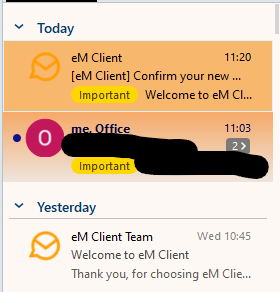
I personally think the new colour for unread emails “works great and is really easy to see” when reading down the list of emails as in my light grey background unread email subject below.
I personally “don’t use gradient colours” and prefer the solid colour background like @Gary had with his solid yellow background with black text example further up this thread. Its then i think much easier to read the unread subjects. So you just have to get the right background colour that works for you.
(eM Client Modern theme with light grey unread mail background)
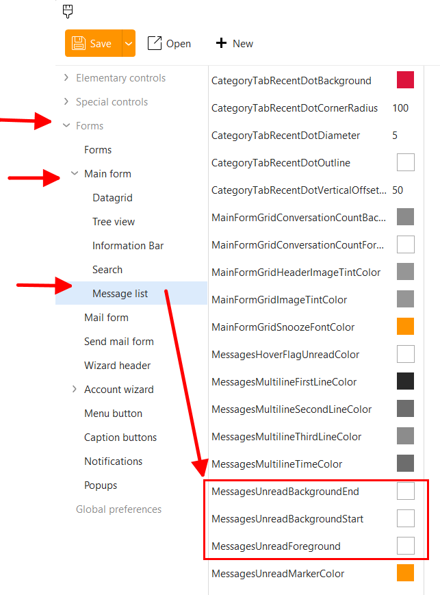
This works great for the unread messages, but I have been trying to find the right setting for the currently selected email in this list for the last hour but I can’t figure it out. Could anyone give me the correct line and where to find it? Thank you!
Sorry to reply to an old thread, but I’m not able to get this to work. Editing MessagesUnreadBackgroundStart, MessagesUnreadBackgroundEnd, and MessagesUnreadForeground has no effect. Have tried switching to the default white theme and customizing the unread options, but that doesn’t work either.
I’ve just started the 30 day trial and I’m on a Mac, if that makes any difference? I’m using eM Client 10.3.2622 (9cd48bf).
Other colour options in the theme editor are working, such as MessagesUnreadMarkerColor.
Also, is it possible to set a different background colour for flagged messages?