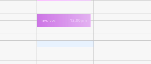
I changed the color of my calendar events to a lighter color in the Properties section, it helped, but still not great. Would also like to change the font size.
I agree,the color is awful.I can’t read any of my events.The colors in the properties help a little,but now it looks like a clown calendar.I hope there is a fix for this.
I also have white on purple for one of my Google Calendars. I updated to version 8 tonight, and you are completely correct. White on purple is completely unreadable.
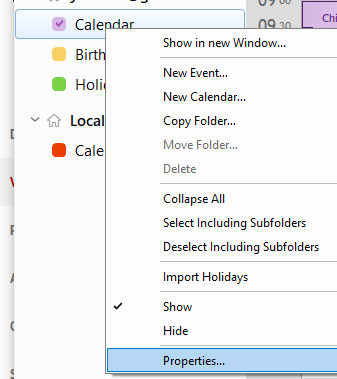
Ok, I right-clicked on that calendar in the calendar list on the left, and selected Calendar Color. I changed it to a dark purple, and now I can read the text again. Hope that helps others. If eMClient is reading, might be better to use black text on the light purpose background.