Hello,
I have a problem with how the font is rendered inside emClient - all other apps have very nice fonts, I’ve tried also other mail clients, but in emClient the font is very sharp and somehow deformed (i’ll send you screenshot, let me know how to do it so it won’t be public)
I’ve tried different fonts, but all of them have this problem
First, this is a user Forum and of course Public.
If you have a Pro version you can raise a ticket, if not, give a full explanation of your issue with Fonts and in particular the areas of the client where you have issue.
You can change some fonts here:
Menu ->Settings ->Mail ->Read
&
Menu ->Settings ->Mail ->Compose
Other than that as far as I know you can only change font color using the built in Theme Editor (or by editing the Theme XML file for specific changes, but ONLY if you know what you are doing.)
Hi,
well I’m thinking about PRO version, but right now I have 30day trial.
Yes I can change fonts, but all of them are ugly rendered
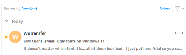
this is Arial in Mailbird
and this is Arial in emClient
font is too bold and “T” is touching “r” and imagine that I see this everywhere and it’s just uncomfortable to read this…
simply the texts are not smooth and some font looks like pixelated and there is wrong letter spacing many times
it’s some text-rendering or font-smoothing issue - I’m a web developer, but I’m not sure how this is called in the windows apps
i checked also themes, but there you can change only colors… there are no options for letter spacings, line heights, or other things like we have in CSS
(i would also like to change inner padding of email body - it’s too small)
I do not use Arial.
¿Where and with what exact settings are you selecting Arial to produce the look you have posted?
I have just checked eMC with Arial on a trial computer and do not see any of the issues you state
you have, so I can not help you with this, perhaps someone else can.
Also, personally I can not believe that you really expect to have the ability to be able make the
changes you suggest as eMC is an eMail client not a graphics program or text editor.
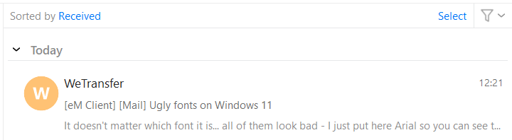
It doesn’t matter which font it is… all of them look bad - I just put here Arial so you can see the difference between emC and another client
So you have Win11 and it looks good on your computer? Can you share some screenshot too? (ideally with “WeTransfer” text)
Just classic settings, nothing special:
Well no, I wish I don’t have to solve things like this and it will work automatically so I don’t need any super extra settings then… but unfortunately it is like it is
I would put here full screenshot of the app and you will see how ugly it is, but i don’t want to expose all my emails
One more thing: I’ve tested it on another computer with Win10 and there is the same problem, so it looks like it’s simple some problem in the app source code
Thank you.
Well it looks much better in your screenshot.
I put it back to Segoe UI and make it just 1px bigger (so 10px) and read emails are ok (not perfect but ok), but unread emails looks still pretty bad - can I somehow change unread email from Bold to Semibold or Medium?