Hello,
I’m getting back to using email clients, and having compared what I had experience with before, as well as newer software, I found that eM Client is a clear winner for me.
I love this software in general and its modern and clean interface in particular.
What seems confusing to me though is placement of toolbars.
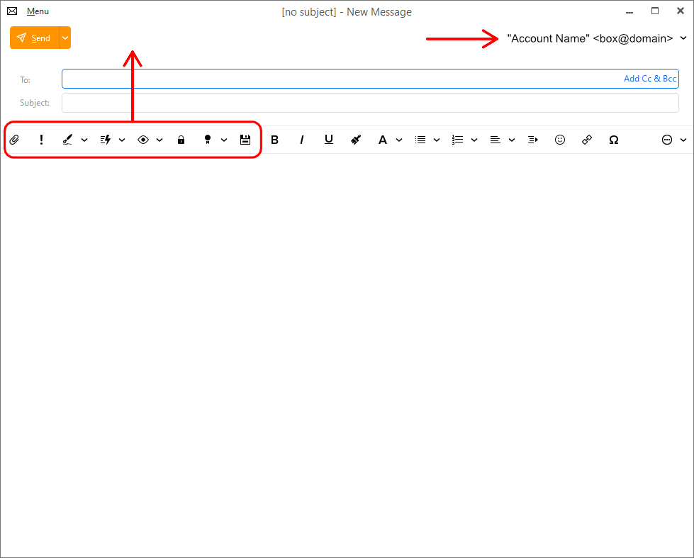
For example, in the New Message window, all the buttons related to email operations sit together with text formatting buttons.
It makes it a bit harder to quickly navigate this combined toolbar when editing the text and then when performing email-specific actions.
At the same time, the Send button sits separately at the top, proud and lonely, sharing the whole line of the interface only with the account name.
Would it make sense to bring the email-specific buttons like Attachment, Signature, Watch for Reply, Save etc. up, next to the Send button and keep the text formatting buttons as they are?
Please see my sketch:
This is a standard approach across different email clients and webmail interfaces, and honestly, there is nothing bad about it.
I have a few more suggestions regarding the toolbars in other eM Client windows if the developers are interested.
Please let me know what you think!
I personally like all the compose message toolbar buttons underneath the subject as they are now.
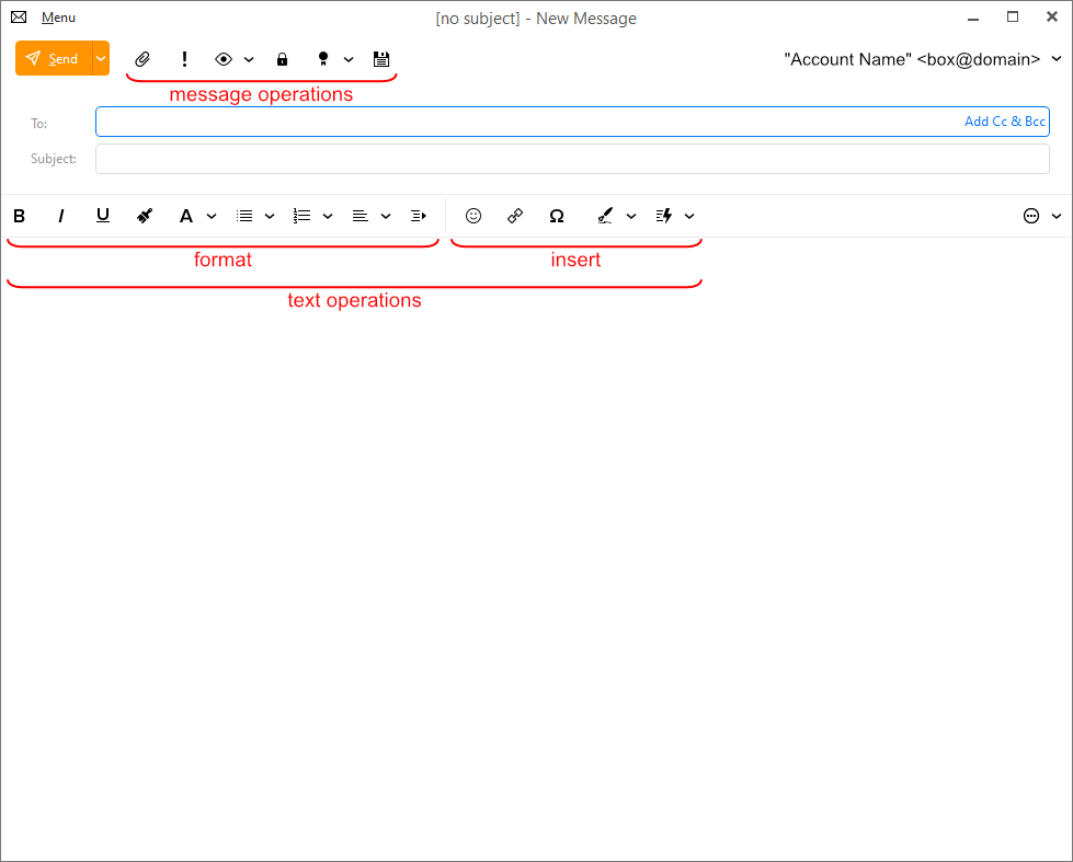
I never thought about this, but looking now at what you refer to as “email-specific buttons”, most of them are related to message composition. From the left: attachment, importance, signature, quick text - all those are directly related to the contents of the current individual message. The only one that might be questionable is the last one, “Watch for Reply”. That is not related to message content, but to message management; a valid argument could be made that it is in the same category as the “Send” dropdown you are pointing to. Then again, that Send button initiates an action, while this Reply dropdown does not; it specifies an option for reply notification.
So, I would say those items you’ve circled in red should stay where they are, since like all the other items on that line, they relate to message composition.
I would say, Attachment is indeed somewhat related to the contents of the message. Signature, QuickText - absolutely 100% related to the text of the message.
But Important, Watch for Reply, Encrypt, Save are more about handling of the message as a whole, rather than editing of its content, and logically, they are closer to Send, rather than to Bold, Itallic, Numberling, Indent etc.
The buttons starting from Bold, on the other hand, are strictly related to text editing, and they do sit where they should be, right above the text.
Long toolbars with multiple items aren’t very user-friendly to be honest, so I still think that the email handling buttons should be separate, and why not to have them in the same icon style as they are, but next to Send, at least as an option.
Here is an example of how a new (optional) toolbar arrangement may look: