Am I the only one that wishes the search box was still in the v9 position? I’ve just upgraded and on v10 it is partly obscured by the webcam on the top of my monitor. Please put it back where it was!
1 Like
Similar sentiments on the topic of the search bar location here: Who the hek came with this idea ?!?
1 Like
Am I the only one that wishes the search box was still in the v9 position?
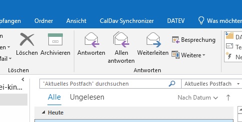
The problem with having the search bar back over on the far right “is that it interferes with users adding too many toolbar custom buttons” which i suspect Outlook & Thunderbird devs found.
As per my example below where i like all my toolbar buttons right across, so if the search bar was at the far right again, then i couldn’t have all the customised buttons across the toolbar and would be limited particularly for users who eg: Only had Low Res screens. So i personally do like having the search bar at the top centre like Outlook and Thunderbird also have done.
![]()
Alternatively maybe eM Client could have a eg: Dual horizontal toolbar so the search field “could then be incorporated at the far right or far left” and still have enough room on dual toolbars for all the customised buttons, as alot of users also wanted / preferred “the search field far left above the subject or message list” as in @dade_murphy example screenshot from another thread.

I use heaps of monitor mounted webcams with V10 using eg: 2K Windows & Mac resolutions and none of them obscure the search bar. I also test regularly using Outlook & Thunderbird “which also have search bars at the top centre position” and they also don’t obscure the search bar.
The search bar at the top centre only gets obscured by the webcam monitor mount because you are in “Full Screen view”. However if you change to “Windowed view” and then drag eM Client top border so the gui is under the bottom of the webcam mount, then you won’t have the problem. eM Client will remember the gui window position when you close and reopen the program.
Our little company just upgraded from V8 to V10 and we are totally shocked of the unusable search bar due to its location.
All workstations are virtualized and connection is made via RDP to the server. The blue colored bar on the top completely hides the search bar. I could unpin the blue colored bar but then people are confused if they are actually in the RDP session or on the local client.
It is a must have to be able to place the search bar to a different location in emclient.
I can’t understand why your company clients haven’t complained about this issue already. This has to be fixed, and not in a further V11 (resulting in additional costs) but in V10.
1 Like
Other applications (including Outlook, Slack etc) has the search bar at exactly the same position. There is a pin icon on the screenshot, just use it not to have the RDP bar always visible.
1 Like
As said the blue bar at the top reminds the users that they are in a RDP session, so I do not want to unpin (hide) this bar.
At least make the search bar moveable to the left or right in the same line, there is enough free space.
Oh and by the way, you don’t have to follow every “fancy” trend. The position of the search bar in Outlook 2019 f.e. was perfect (and is still in company use here).
It is not because of “fancy” trend but because a huge number of our users requested it, you can find it in the history of this forum. In fact there were a lot of complaints when we moved the searchbox to the top right corner. The typical argument was that it is too far from the message list and it is hard to reach it by mouse. No solution works for everybody.
As far as I remember, the RDP-bar can be moved (?).
Perhaps the RDP-Client is smart enough to remember the location of the RDP-bar in the next session?
The solution that works for everyboy is to be able to position the search bar wherever a user wants. However, failing that, it could be just 3 choices - left, right or center. Personally I want it left.
1 Like
We’ll consider some additional customization of the search position in the future versions.
This is the one and only reason I rolled back to v9. I have multiple accounts and it was nice to have the folder and account name at the top with the search bar to the right of the actions. The current format is a no-go for me.
So in your case the problem is not the position of search bar, but missing information in the title bar?
Mostly yes. I prefer the search bar to the right but my biggest issue is simply not having being able to tell what account/folder I’m in with a glance at the title bar. Edit: To elaborate, I believe, if i recall correctly, that the folder name is at the top of the message list but not the account. Adding the account there as well as the folder would serve the same purpose although having it front and center at the top is easier to see.
I will second the request for it to be back on the right.
Of course, if we were really going Mac with this you should be able to move it anywhere (on the toolbar) you like…
But definitely move it down into the toolbar – right now it’s just wasting a lot of precious screen real estate.
2099 probably !