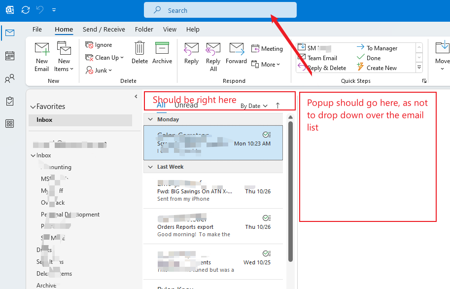
There needs to be a searchbox so you can search for emails from subject to from etc, directly above the email subjects not stuck over the right hand side.
See screenshot, it shows the repositioned searchbox located over the subject of emails.

8 Likes
Yes i would also prefer the “search” field over on the left. It is weird that its way over on the right.
The Search field also doesn’t have to be as wide. Could also take a eg: quarter of the width in size…
I would even suggest instead of a default wide field to have a search “Magnifying Glass” icon at the top left which when clicked will open the Search Field to then take up less space on the toolbar by default.
1 Like
I like the idea, but I’m not so sure it would work for me. The other email clients I use have the search box on the right, or towards the right, and it might get confusing to have it in different places.
Of course if you could configure them all the same, or you only use one client where you were able to have it where you wanted, that would be great. 
Another suggestion for the search field is to eg: add it into the current toolbar “customise” option along the top, where you could then move it anywhere on the toolbar. You could then move it to suit each user.
2 Likes
I support that. I love eM Client, but the position of the search box makes eM Client so cumbersome to use! ![]()
5 Likes
Absolutely agree, there needs to be an option to adjust searchbox position.
3 Likes
I actually switched back to Outlook due to this issue. The search box is the feature I use most in an email client. In Outlook it works so fast and intuitively. When I use eM Client instead, I lose so much time when searching for emails. For me, it’s just too frustrating using eM Client until this problem is resolved ![]()
2 Likes
Yes. The search should be just above the list that is being searched. And it’s the email subject list. It’s weird that it’s kept to the top right as if it’s a useless thing that needs to be ignored and hidden away. I search constantly and my mouse is mostly in the subject list view. I have to move the mouse to the top right every time. Its not a voting request decision. Its a basic UX and commonsense to have it on the top of what you are searching. Or at least give that option in customization. You have tones of customization but not this.
3 Likes
another vote to allow the search to be moved to the LEFT and NOT the far RIGHT.
In version 10, due to be released next year, the search box will be in the middle replacing the title bar.
5 Likes
Absolutely! The popup should start from the right of the search box, so as not to drop down over your email list.
EmClient, why not ask your customers where they would like it, instead of just moving it? Just curious Feature request
1 Like
Here is how my Outlook has it. Its much better positioned than eM Client, but its not perfect. See my cartoon for “perfect” ![]()
![]()
![]()
4 Likes
I guess you didn’t see my screenshot above from version 10. We will have it in exactly the same place; right in the centre of the title bar.
1 Like
Yes, I did. It looks like its centered on the title bar though instead of directly above the email list. At minimum it needs to always be straight up from the email list. My screen in the ![]() post makes it look like its centered because its cut off. Here’s the actual.
post makes it look like its centered because its cut off. Here’s the actual.
@Gary, I appreciate you chiming in here, although I’m not sure if you’re an employee of eMc or not. In case you haven’t noticed, I’m trying to help you guys become a real complete replacement for outlook.
![]()
3 Likes
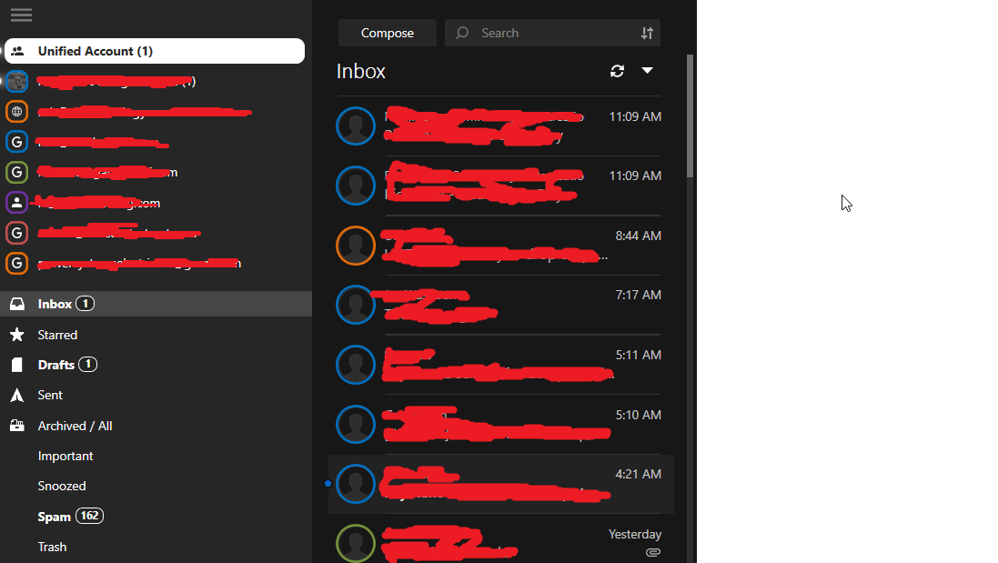
The search bar location in Mailbird is in an ideal location and requires very little mouse movement.
1 Like
You guys have given tons of customization on colors and fonts. Can you not give us 3 options to load this search box in UI customization? Search is important.
- Please give one option directly above the email list where it part of the first row in emails. @ejbiker93ss has shown. This is my preference too. This is implemented in Spark mail very nice with boolen ui tags.
- Then you have the new design as like Outlook in the center header.
- keep your old design to far left where no one notice it.
4 Likes
I have a 30" screen with a pretty high resolution. I feel like I have to move to the next room just to reach the search bar. It makes no sense whatsoever. Having it in the middle is an improvement, but I still dont quite understand why the searchbar is not directly above the place it will be searching. If im going back and forth searching for emails, it is just weird to have the search bar so far away. specially considering the top left corner has nothing except filter (which is in the correct location) and the new and refresh buttons.
3 Likes
I would also prefer the search bar to be closer to the message list
1 Like
Another vote to move the search field out of the title bar and closer to the messages list / content. Having it dead center in the title bar makes no sense and interferes with window management. Please move it back.