Move today button in the calender out of the submenu for faster access. Or even better allow the customisation of it.
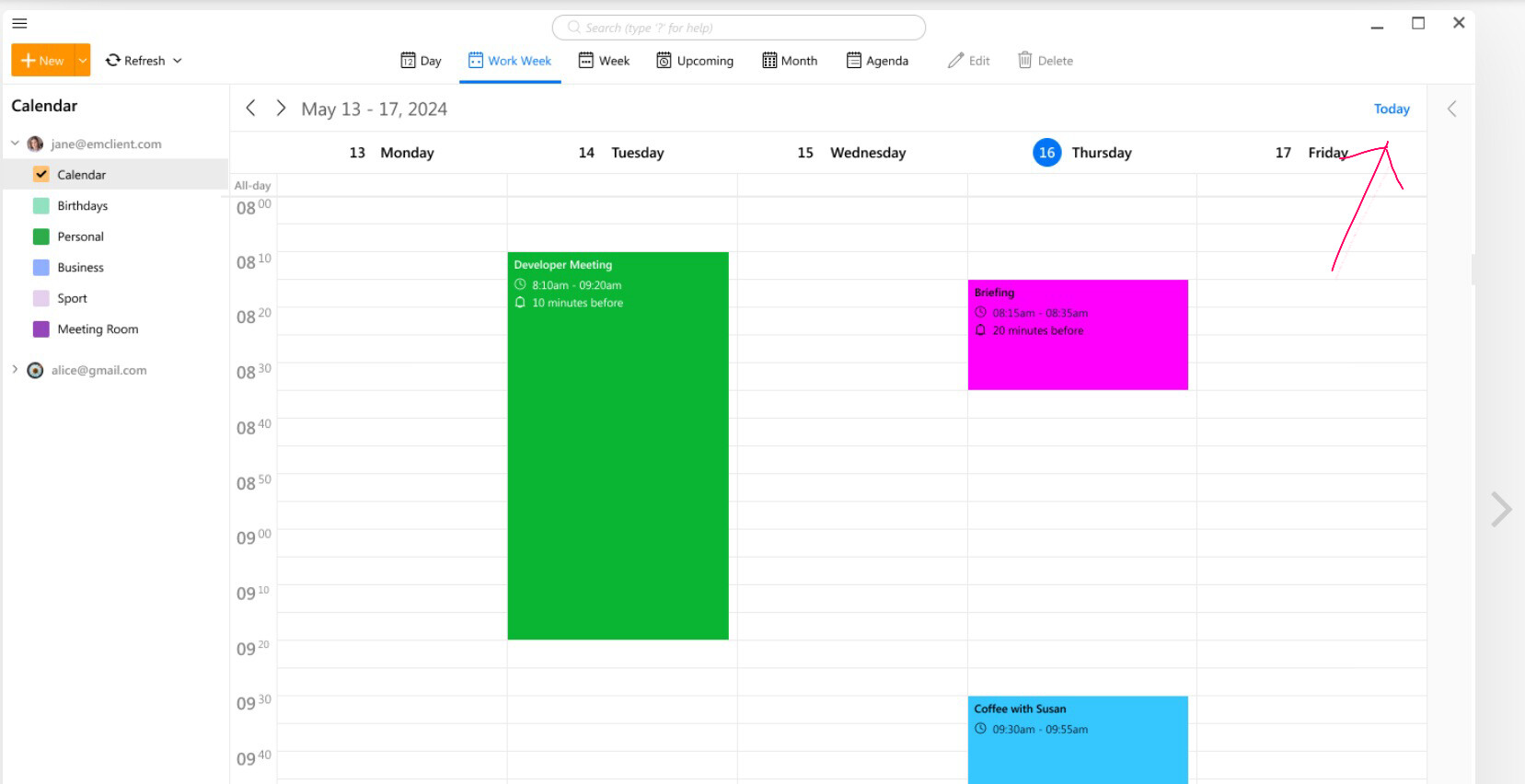
Today is “at the top right” of the desktop and mobile calendars as per the below eM Client website example screenshot
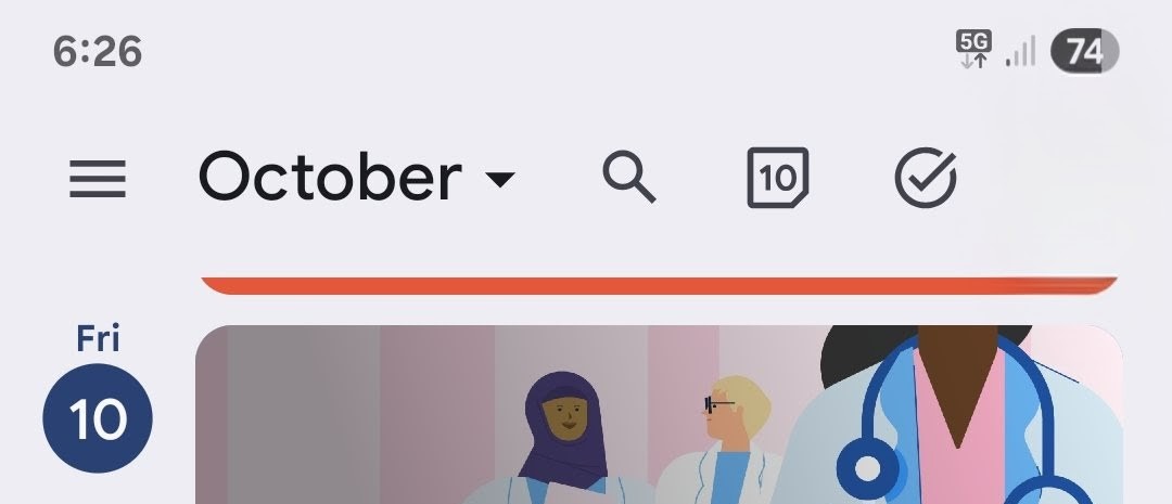
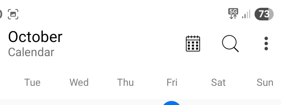
Yes for sure, but im talking about mobile. There its hidden under the three dot menu
Ok ok yes thats true, i also press Go to Today a lot on the mobile devices which yes agree takes longer and would be good to also have a Today icon on the eg: left of the calendar views icon.
Suggest to add a Sleekplan suggestion for that & add that under the iOS/Android category.
There is simply not enough space for that on mobile. We don‘t plan that.
There is simply not enough space for that on mobile
But there is alot of space “along the top” for a Go To Today icon ?
Eg: The Google mob app does fit it in where they have 3 icons to the left of the profile account icon and eM Client app would still have “alot more space” to still look ok even if it was added in ?