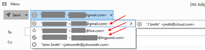
When composing a new message, up at the very top of the window – next to the Send button – there’s the “from” drop-down button, allowing the user to select what sender identity they wish to use.
This used to be a simple drop-down list which was rapid, easy, and involved few mouse movements.
After the latest upgrade, this list has become a cascading series of sub-menus, with sender identities grouped by the accounts under which they are configured. Please tell us there’s a way to disable this new functionality. It’s much, much slower to use this style of menu and badly impacts productivity.
I might also say that it’s essential to give us a way to disable the “icons” or “avatars” or whatever we’re calling them for recipients in the “To” and “CC” fields while one is typing.
The avatars make the pop-up suggestion box take up more real estate on the screen and also are much more visually arresting than mere text.
This introduces massive visual clutter and is a huge accessibility nightmare. Making dramatic changes to deeply essential workflows of a critical productivity application such as an email client is something that really can benefit from the advice of people who are neuro atypical, etc. The latest changes may look like fun razzle dazzle but most of the ones I’ve seen thus far are going to absolutely crater a lot of people’s ability to use eM Client smoothly.
After the latest upgrade, this list has become a cascading series of sub-menus, with sender identities grouped by the accounts under which they are configured
Yes that’s how it is now in V9 unless you go back to V8. I don’t think you can change it otherwise.
You’re kidding me. You have GOT to be kidding me.
How is this being forced on people with no consideration like that?
If there is a way, I’m sure someone will update this thread.
Thank you, fingers crossed.
I have known many software projects where people can fund a bounty on certain features or fixes. I’d definitely compensate a developer who could make the changes described in this thread to enhance and restore productivity in the latest version.
I don’t know if this helps you, but i found you “can also ignore” the pop out sub menus on the right of the dropdown email accounts in the compose window, (which are only the alias email address’s for those accounts) and just click on the actual sending email address account name directly, which then selects the account email address.
So its only if you need to select “an alias email address” that you need to click the sub popout menu if that makes sense.
I need to send using aliases. Constantly. Like a hundred times a day, sometimes.
It used to be amazingly fast and one could sweep down the list with a single click. Or even using arrow keys.
Now floating and hovering and waiting for pop-outs, etc… it’s crushing my ability to use eM Client.
Ok i see. Well hopefully eM Client Devs might then be able to then do an update to eg: Separate the aliases on “another dropdown menu” next to each account to avoid the submenu alias popout.
The easiest and fastest (and probably best) solution to accessibility issues that arise when new features like this are implemented is giving users a checkbox in settings that reverts a behavior or interface to whatever way it used to be.
Least amount of code needed, best user experience because it simply allows them to go back to their existing and established workflow.