Using the new version 9 which I am liking. The avatars for each person/email is nice, but it does leave one thing less obvious. Unread messages are just signaled by a tiny little dot that is hardly noticeable. I frequently will mark messages as unread so I know to go back to them later which could be days or weeks later. In version 8 this worked well because they could be easily seen, in version 9 however less so.
You can change the color of the little flag next to them, but it is also too small to be useful next to the large avatar icons. When you select a message to read the line for that message gets highlighted in light gray. Could you provide a customization to the theme so the unread messages could be turned another color so they stand out more?
In version 8 the bold type was all that was needed, but in version 9 with the large circular avatar icons, the bold type just isn’t as special with all the other text that also appears (subject, 1st line of the email, etc.) It isn’t impossible, just not as “LOOK AT ME” as it used to be in version 8 is all.
I actually like the avatar as it makes the distinction between emails easier to look through.
I see the bold just fine it just isn’t impressive in the sea of emails. Yeah using the default theme other than trying to change the color of that tiny little dot to red to see if that helps make them stand out more.
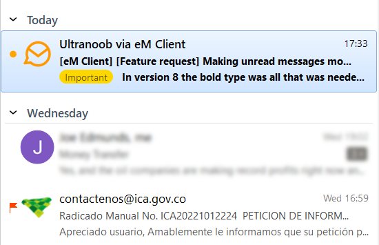
This is how it looks now. Yes I’ve blurred out a bit, but basically this is how difficult it is to see the bold text and little red dot right now. Can you quickly find the unread message while scrolling down a long list of email like this?
Oh I know it will be usable because that is how it looked in Version 8 and I was perfectly fine with that. But I like the Avatar of this Version 9 and would like to continue using it.
As this is a feature request part of the forum, I’m just requesting a feature Just something that would be helpful for ease of viewing.
I do see the couple other changes I made, I like to see the scroll bars all the time and stuff like that, but other than that my theme that I took screen shots of is exactly the same as the Modern Default as far as the text looks, color, etc. The text is bold like you noticed, but being lighter gray it isn’t really noticeable just like in the screen shots I shared.
SixtiesFan’s screen shot showing it all bold would help a bit, but I want to reiterate I’m not looking for tech support here. I’m requesting a feature. People that don’t want to use it can just leave the color white in their theme, but it would be nice if we could chose the color of an unread message like I show in the ‘requested’ screenshot above.