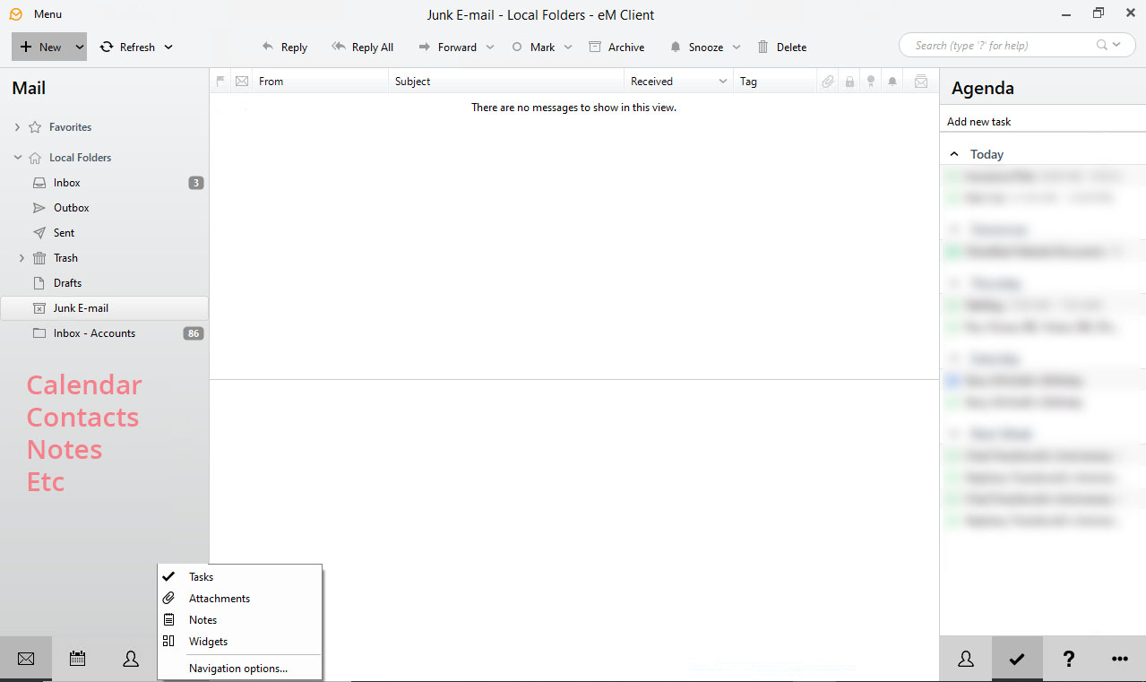
Please consider making the main navigation simpler.
Clicking the 3dot menu system to get to notes takes more time then just clicking notes if it was in the left navigation pane. Plus on a tablet computer, clicking the 3dot menu button is easy, but I often get attachments not notes when clicking the sub-menu with my finger.
Please consider just listing the features in the left navigation pane (attachment: example shown in red) . I think it would be simpler and more tablet friendly. Then maybe your Navigation Options become what features you want listed in the main left navigation pane (display email, calendar, and notes).
Thanks in advanced
I would agree, but only if it is an optional setting. I have a long list of folders that takes up all the space in the navigation pane, so I’m happy with the design at it is.
v7.xx worked exactly like this. Another downgraded missing feature no one asked for in v8.xx
1 Like
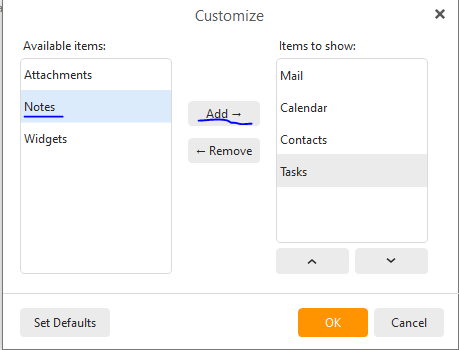
if you click on “Navigation options” then you can set Notes to also appear in that Navigation pane on the bottom. If you have the left page set narrowly, try pulling it a little to the right so that all the icons fit.
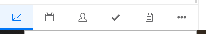
@Hope777 YES that is true. But to see all the icons you have to make the left navigation extremely wide. Respectfully, I prefer the widest column to be the actual content (email/calendar) not a menu.
I absolutely agree. Reset the left navigation panel to the previous version or make the icons significantly smaller so that the left column becomes smaller.