Hi,
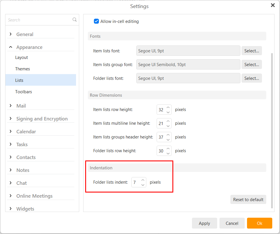
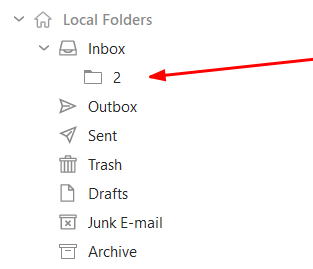
On top of the many errors generated by emClient when sending/receiving emails as mentioned by many others here, the local folders icons are really bad! They are too light, we can’t change their colours to make some more prominent and the sub folders are not indented enough, it’s hard to differentiate folders from sub folders most of the time.
Will this ever be fixed?