Yes, unfortunately the Dark Theme is not suitable for a lot of things.
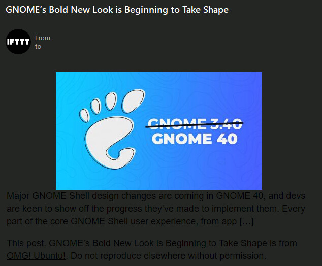
I receive messages generated by IFTTT, and they are also unreadable in the Dark Theme. So I use another Theme.
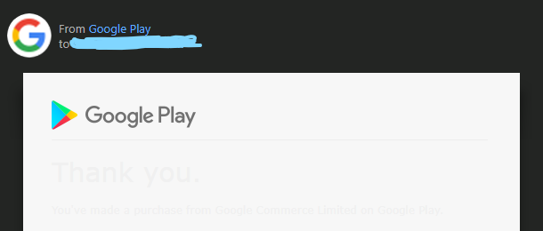
@madeinos Yes my Google Play receipts are also like yours in Dark Theme.
However 99% of my other received emails though are ok in EMC. So for those 1% of emails that are not right in EMC Dark Theme, I open those via Gmail online as prefer to stay in the Dark Theme.
However as @Gary says you can always switch to another theme.
1 Like
Unless of course a theme editing pundit comes forward and suggests a way to change the message body text in the theme. Maybe that is possible, I just never got into theme editing so don’t know if that is something that can override the message HTML. 
But then how do you decide on what color to choose for the text? In @madeinos example it would have to be a darker color, but in mine it would have to be a lighter color 
2 Likes
I have this too, some of my customers who have set a background color specifically come in on dark gray on dark gray to me  I think it might be nice if EMclient had some option that says “fallback html color” or something for foreground. If foreground== current background use the set fallback color for foreground (say white). Some spam senders do use background and foreground color equal so it would have do work around this as a false positive.
With the dark theme, a Google Play receipt like in the first message looks unreadable only if I
- allow messages to display images,
- use the “color from theme” for text and background in settings > mail > read > preferred style.
To avoid unreadable messages, I have set the colours in the “preferred style” to black text on white background.
Much was done in developing the Dark Theme to overcome a white background limitation, as it never used to be possible to have a true dark background before 8.1. Seems this is just going backwards to specify a light background in a dark theme even though it might be your personal preference.
This setting however does not change the text color where a color is already specified in the message HTML. Unless as you say, you choose to view all messages as plain text. But then most messages are missing so much formatting and images if displayed that way.
I don’t. I only checked the option Mail > Privacy > Unsafe Content > Block unsafe content except when from whitelist senders (recommended). This practically prevents all images (as far as I can see it) from being displayed in HTML messages.
Sorry. Above where you said that the message is unreadable only if you allow it to display images, I assumed that you meant that you disable displaying of images by choosing plain text display.
However, disabling linked content (as you have now clarified) should not affect how the text is displayed.
Yes, you are right, I checked again. So only my second bullet point above makes the difference.
True, this makes the dark theme only partly dark. The dark theme does not look very good with black on white message display because the dark theme is very dark. I find the contrast between the black message list and a white message background a bit irritating. That’s why I took the “Dark” theme to make my own “less dark” one, thanks to the theme editor.
Yeah, I like the idea of a less dark Dark Theme. ![]()
It would be a lot easier on my eyes as well.
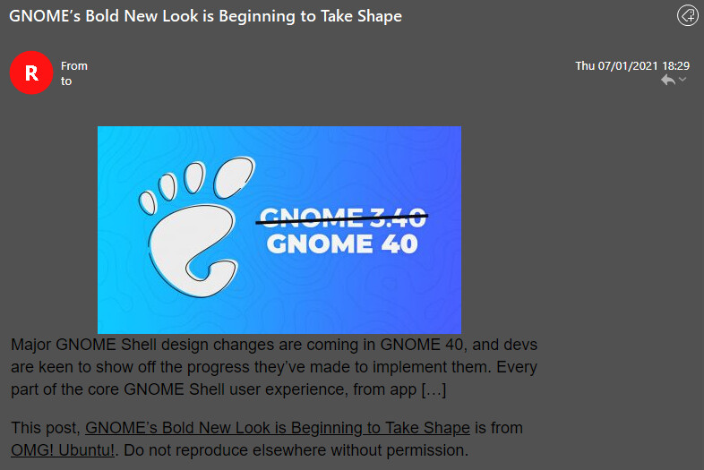
My “Less Dark” theme is now on eM Client - Email Client and Calendar Software for Windows and Mac.
1 Like
That’s great.
Even my IFTTT messages are readable. Compare the following with the previous one I posted.
Are you turning me to the dark side @eisbaer? 
Looks good to me.  I actually use the “Less Dark” theme myself, if you are looking for a customer testimonial. I usually find the light themes too tiring for the eyes, but found the dark theme that comes with eM Client too dark.
Absolutely great!
During the day I don’t mind the default Modern Theme, but as we move into evening, it is so much better on the eyes to have a darker theme. The included Dark Theme is OK, sometimes hard to read as this thread describes, but I don’t find it that easy on my eyes. Maybe it is too much of a contrast.
Your middle ground certainly looks like a good compromise. Thanks.
You’re telling your age, folks!
1 Like
Oh darn! 
I’m not really that old, just staring at the monitor too long.
1 Like
You’ve got me there.
1 Like
hey guys, just adding onto this thread. I got something today from someone that was an image with a transparent background. They meant to have it be black text on a white background. To me though it came up as black text on a very dark gray background. I realize dark mode may be trying to be very dark, and this is sometimes what I want. However, in this case it is not. Outlook web access gives me a toolbar button “View with a light background”. This would be a perfect addition to EMC to allow me that one time to see what I need to see and not get into crazy AI based logic to try to determine what I want to see.
1 Like
I think that would be an excellent feature.
1 Like