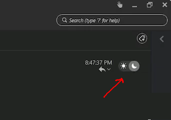
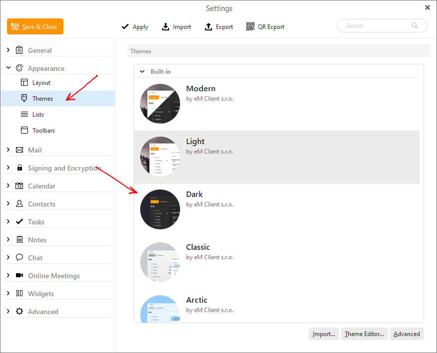
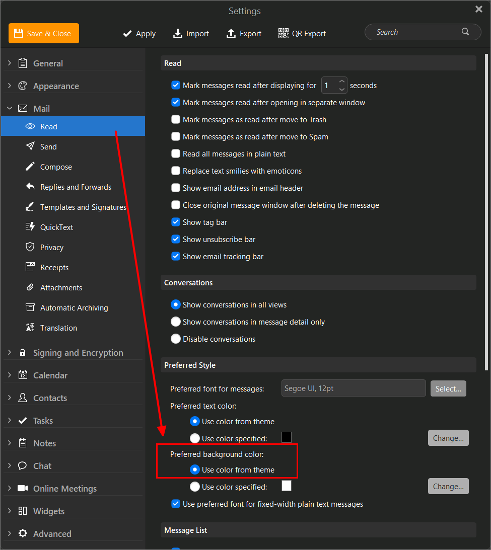
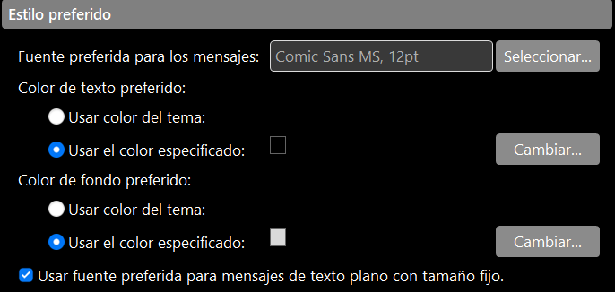
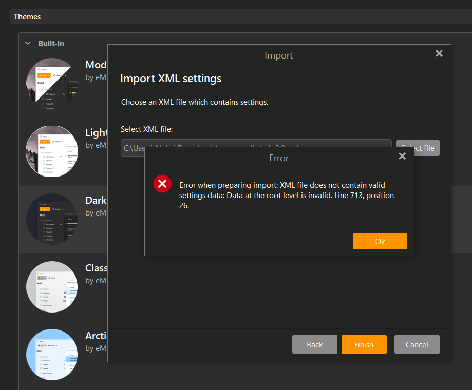
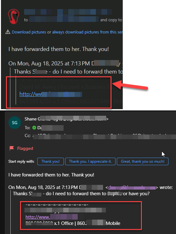
Hi there, I prepared this example of how the dark mode HTML rendering sometimes renders things I cannot read. It is however read correctly on my iphone also in dark mode.

I can’t attach the full HTML but can provide it to support.
snippet:
Copyright(C) 2024 United States Postal Service(R). All Rights Reserved. Informed Delivery™ and the trade dress of USPS(R) Packaging are among the many trademarks of the U.S. Postal Service(R).
This is an automated message. Please do not reply.
–1c8fc9177dae41ff7e21ed912d18b2895048c7e2e817fd7f4e10e93a4823
Content-Transfer-Encoding: quoted-printable
Content-Type: text/html; charset=“utf-8”
        .img-dark-mode, .x_img-dark-mode,
        .multi-envelope-icon-dark-mode, .x_multi-envelope-icon-dark-mod=
e {
filter: invert(0%) sepia(100%) saturate(0%) hue-rotate(348d=
eg) brightness(0%) contrast(100%) !important;
}
        .primary-background-color {
            background: linear-gradient(#333366, #333366) !important;
        }

        .secondary-background-color {
            background: linear-gradient(#3573B1, #3573B1) !important;
        }

        .header-font-colors {
            color: #333366 !important;
        }

        .dark-mode-section {
            background: linear-gradient(#F7F7F7, #F7F7F7) !important;
            background-color: #F7F7F7;
            color:#000001 !important;
        }

        .primary-font-color,
        .responsive-header {
            color: #333366 !important;
        }

        .secondary-font-color {
            color: #000001 !important;
        }

        .tracking-number a {
            color: #3573B1 !important;
        }

        .estimated-delivery {
            color: #000001 !important;
        }

        .warning-message {
            color: #000001 !important;
        }

        .linkable-text {
            color: #333366 !important;
            text-decoration: none !important;
        }

        .linkable-text:focus {
            outline: 3px solid #52addb !important;
        }

    }

    /* LIGHT Mode END */

    /* Dark Mode media queries to target some Android and Outlook.com *=
/
@media (prefers-color-scheme: dark) {
        .img-dark-mode, .x_img-dark-mode,
        .multi-envelope-icon-dark-mode, .x_multi-envelope-icon-dark-mod=
e {
filter: invert(100%) sepia(100%) saturate(0%) hue-rotate(20=
4deg) brightness(103%) contrast(104%) !important;
}
        .primary-background-color {
            background: linear-gradient(#3573B1, #3573B1) !important;
        }

        .secondary-background-color {
            background: linear-gradient(#333366, #333366) !important;
        }

        .header-font-colors {
            color: #fffffe !important;
        }

        .dark-mode-section {
            background: linear-gradient(#2A2A32, #2A2A32) !important;
            background-color: #2A2A32;
            color:#fffffe !important;
        }

        .primary-font-color,
        .responsive-header {
            color: #fffffe !important;
        }

        .secondary-font-color {
            color: #fffffe !important;
        }

        .tracking-number a {
            color: #fffffe !important;
        }

        .estimated-delivery {
            color: #fffffe !important;
        }

        .warning-message {
            color: #fffffe !important;
        }

        .linkable-text {
            color: #fffffe !important;
            text-decoration: none !important;
        }
    }
    /* DARK Mode END */

    /* targets color attribute outlook web */
    [data-ogsc] .fubar {}

    /* targets background attribute outlook web */
    [data-ogsb] .primary-background-color {
            background: linear-gradient(#333366, #333366) !important;
        }

    [data-ogsb]  .secondary-background-color {
            background: linear-gradient(#3573B1, #3573B1) !important;
        }

    .primary-background-color {
        background-color: #333366 !important;
    }

    .secondary-background-color {
        background-color: #3573B1 !important;
    }

    .header-font-colors {
        color: #333366;
    }

    .dark-mode-section {
        background-color: #F7F7F7 !important;
        color: #000001;
    }

    .from-section-desktop {
        border-bottom: 2px solid #b8b8b8 !important;
    }

    .from-section-mobile {
        background-color: #F7F7F7 !important;
        border-bottom: none;
    }

    .primary-font-color,
    .responsive-header {
        color: #333366;
    }

    .secondary-font-color {
        color: #000001;
    }

    .email-box-shadow {
        box-shadow: 0px 8px 4px -4px#dee2e6 !important;
    }

    .mobile {
        mso-hide: all !important;
        display: none !important;
    }

    .expected-items-total {
        background-color: #333366 !important;
        min-width: 80px;
        padding: 10px 8px 8px 8px;
        margin: 0;
        font-size: 15px;
        text-align: center;
        color: #fffffe !important;
        border-radius: 12px;
        font-weight: normal !important;
    }

    .linkable-text {
        color: #000001;
        text-decoration: none !important;
    }

    .linkable-text:focus {
        outline: 3px solid #52addb !important;
    }

    .primary-button {
        background-color: #333367 !important;
        border: none !important;
        border-radius: 3px;
        color: #fffffe !important;
        display: inline-block;
        font-size: 16px;
        line-height: 44px;
        text-align: center;
        text-decoration: none;
        width: 225px;
        -webkit-text-size-adjust: none;
        white-space: nowrap;
        -webkit-text-size-adjust: none;
        height: 42px;
        font-weight: bold;
        font-family: Arial, Helvetica, sans-serif;
        vertical-align: middle !important;
        margin-right: 20px;
    }

    .view-dashboard-a {
        text-decoration: none !important;
    }

    .view-dashboard-button {
        border-radius: 3px;
        padding: 9px 10px;
        border: 1px solid #fffffe !important;
        text-decoration: none !important;
        cursor: pointer;
        text-align: center;
        font-weight: bold;
        font-size: 16px;
        height: 44px;
        color: #fffffe !important;
        width: 200px;
        white-space: nowrap;
    }

    .view-dashboard-button:focus {
        outline: 4px solid #52addb;
    }

    .secondary-button {
        border: 1px solid #333366;
        background-color: #fffffe !important;
        border-radius: 3px;
        color: #333366 !important;
        display: inline-block;
        font-size: 16px;
        line-height: 44px;
        text-align: center;
        text-decoration: none;
        width: 225px;
        -webkit-text-size-adjust: none;
        white-space: nowrap;
        -webkit-text-size-adjust: none;
        height: 42px;
        font-weight: bold;
        font-family: Arial, Helvetica, sans-serif;
        vertical-align: middle !important;
        margin-right: 20px;
    }

    .expected-items-total {
        background-color: #333366 !important;
        min-width: 80px;
        padding: 10px 8px 8px 8px;
        margin: 0;
        font-size: 15px;
        text-align: center;
        color: #fffffe !important;
        border-radius: 12px;
        font-weight: normal !important;
    }

    .more-mail {
        border-bottom: 2px solid #999999;
        padding-bottom: 5px;
    }

    .more-mail p {
        font-size: 12px;
    }


    .legal p {
        font-size: 11px;
    }

    .legal td {
        color: #000001 !important;
    }

    .legal td a {
        color: #3573B1 !important;
    }

    .tracking-number {
        font-size: 16px;
        font-weight: bold;
    }

    .estimated-delivery {
        font-size: 16px;
    }

    .warning-message {
        border-left: 10px solid #D4352D !important;
        padding-left: 15px;
        margin-right: 25px;
        line-height: 22px;
        margin-top: 0px;
    }

    * {
        -ms-text-size-adjust: 100%;
        -webkit-text-size-adjust: 100%;
    }

    html,
    body {
        margin: 0 !important;
        padding: 0 !important;
    }

    table,
    td {
        mso-table-lspace: 0pt !important;
        mso-table-rspace: 0pt !important;
        font-family: Arial, Helvetica, sans-serif;
    }

    .custom-email-doc {
        font-family: Arial, Helvetica, sans-serif;
        font-size: 15px;
        font-weight: normal;
        display: block;
        margin: 0 auto;
        max-width: 800px;
    }

    p {
        font-family: Arial, Helvetica, sans-serif;
        font-size: 15px;
        font-weight: normal;
    }

    hr {
        clear: both;
        display: block;
        height: 2px;
        background-color: #b8b8b8 !important;
        border-top-width: 0px;
        border-right-width: 0px;
        border-bottom-width: 0px;
        border-left-width: 0px;
        border-top-style: none;
        border-right-style: none;
        border-bottom-style: none;
        border-left-style: none;
        margin-top: 0px;
        margin-right: 0px;
        margin-bottom: 0px;
        margin-left: 0px;
    }

    a {
        font-family: Arial, Helvetica, sans-serif;
        color: #3573B1;
    }

    a img {
        border-top-width: medium;
        border-right-width: medium;
        border-bottom-width: medium;
        border-left-width: medium;
        border-top-style: none;
        border-right-style: none;
        border-bottom-style: none;
        border-left-style: none;
    }

    img {
        outline-width: medium;
        outline-style: none;
        outline-color: initial;
        text-decoration: none;
        /* max-width: 100%; */
    }

    h2 {
        font-family: Arial, Helvetica, sans-serif;
        font-size: 21px;
        font-weight: bold;
        margin: 0;
        padding: 5px 0;
    }

    table {
        border-spacing: 0 !important;
        border-collapse: collapse !important;
    }

    .header h1 {
        font-size: 33px;
        font-weight: bold;
    }

    .header tbody tr td a img {
        padding-left: 30px;
    }

    .refer {
        border-top: 2px solid #999999 !important;
    }

    .refer button {
        margin-right: 20px;
        margin-bottom: 20px;
    }

    b,
    strong {
        font-weight: bold;
    }

    i,
    em {
        font-style: italic;
    }
@media screen and (max-width: 768px) {
.view-dashboard-button, a.view-dashboard-button {
border: none!important;=20
text-decoration: underline !important;
font-weight: normal !important;
}
}
@media screen and (max-width: 960px) {
.desktop {
mso-hide: all !important;
display: none !important;
}
        .mobile {
            display: block !important;
        }

        .mobile-button {
            border: none !important;
            text-decoration: underline !important;
            font-weight: normal !important;
        }

        .responsive-header {
            font-size: 18px !important;
            margin-right: auto !important;
        }

        .responsive-header-logo {
            margin-left: auto !important;
        }

        .from-section-desktop {
            border-bottom: none !important;
            border-top-right-radius: 18px;
        }

        .from-section-mobile {
            border-bottom: 2px solid #b8b8b8 !important;
        }
    }

    @media screen and (max-width: 573px) {
        .primary-button {
            width: 100% !important;
            margin-bottom: 20px;
            margin-right: 0 !important
        }

        .secondary-button {
            width: 100% !important;
            margin-top: 0 !important;
            margin-right: 0 !important
        }

        .refer button {
            margin-right: 0 !important;
        }

        .referButtons {
            text-align: center !important;
            margin-left: 0px !important;
        }

        .refer-email-button,
        .refer-text-button,
        #refer-email-link,
        #refer-text-link {
            text-align: center !important;
            margin-left: 0px !important;
            display: block !important;
            width: 100% !important;
        }
    }

</style><!-- Begin: Makes background images in 72ppi Outlook render at=
correct size. →
@media screen and (max-width: 960px) { .desktop { mso-hide: all !important; display: none !important; } .mobile {
display: block !important;
}
.mobile-button {
border: none !important;
text-decoration: underline !important;
font-weight: normal !important;
}
.responsive-header {
font-size: 18px !important;
margin-right: auto !important;
}
.responsive-header-logo {
margin-left: auto !important;
}
.from-section-desktop {
border-bottom: none !important;
border-top-right-radius: 18px;
}
.from-section-mobile {
border-bottom: 1px solid #b8b8b8;
}
}
@media screen and (max-width: 573px) {
.primary-button {
width: 100% !important;
margin-bottom: 20px;
margin-right: 0 !important
}
.secondary-button {
width: 100% !important;
margin-top: 0 !important;
margin-right: 0 !important
}
.refer button {
margin-right: 0 !important;
}
.referButtons {
text-align: center !important;
margin-left: 0px !important;
}
.refer-email-button,
.refer-text-button,
#refer-email-link,
#refer-text-link {
text-align: center !important;
margin-left: 0px !important;
display: block !important;
width: 100% !important;
}
}
</style><!--[if mso]>
<table role=3D"presentation" class=3D"mso-ghost-wrapper" align=3D"c=
enter" width=3D"820" cellpadding=3D"0" cellspacing=3D"0" border=3D"0">
<td width=3D"100%">
<![endif]–>
<=
!-- to get around auto margin/padding inconsistencies on mobile -->
There is one or = more mailpieces for which we do not currently have an image that is includ= ed in today's mail. |