I am finding Conversations a little hard to see, compared to other e-mail clients, and had a few suggestions I hope could be considered.
LIST PANE
-
An option that if you click the conversation in the messages list, it expands all the individual messages, rather than having to click the dropdown arrow.
-
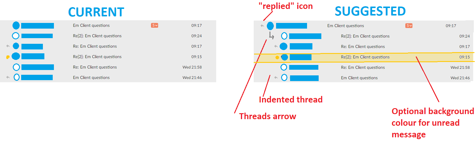
When you expand the thread in the list pane, it would be good if the expanded messages below became indented, otherwise it looks like they are separate e-mails rather than part of the conversation. By not indenting, it also makes it look like the header is a message in the thread, rather than being the header.
-
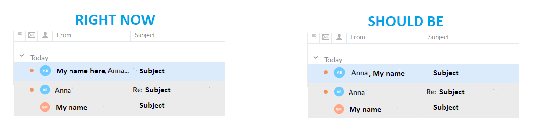
If the conversation has been replied to by me, it would be useful to have a reply icon in the List view on the main heading/message, without having to expand the conversation to see I have replied at some point. All other mail clients I have used put a reply icon next to the main/top conversation e-mail to show this, as well as icons next to individual e-mails replied to within the thread. eMClient only puts “replied icons” next to the individual e-mails, and not the main one. So you don’t know you have replied to a conversation just by quickly looking at it. You must expand it to see you have replied.
I have attached an example of what I am suggesting to make it clearer.
READING PANE
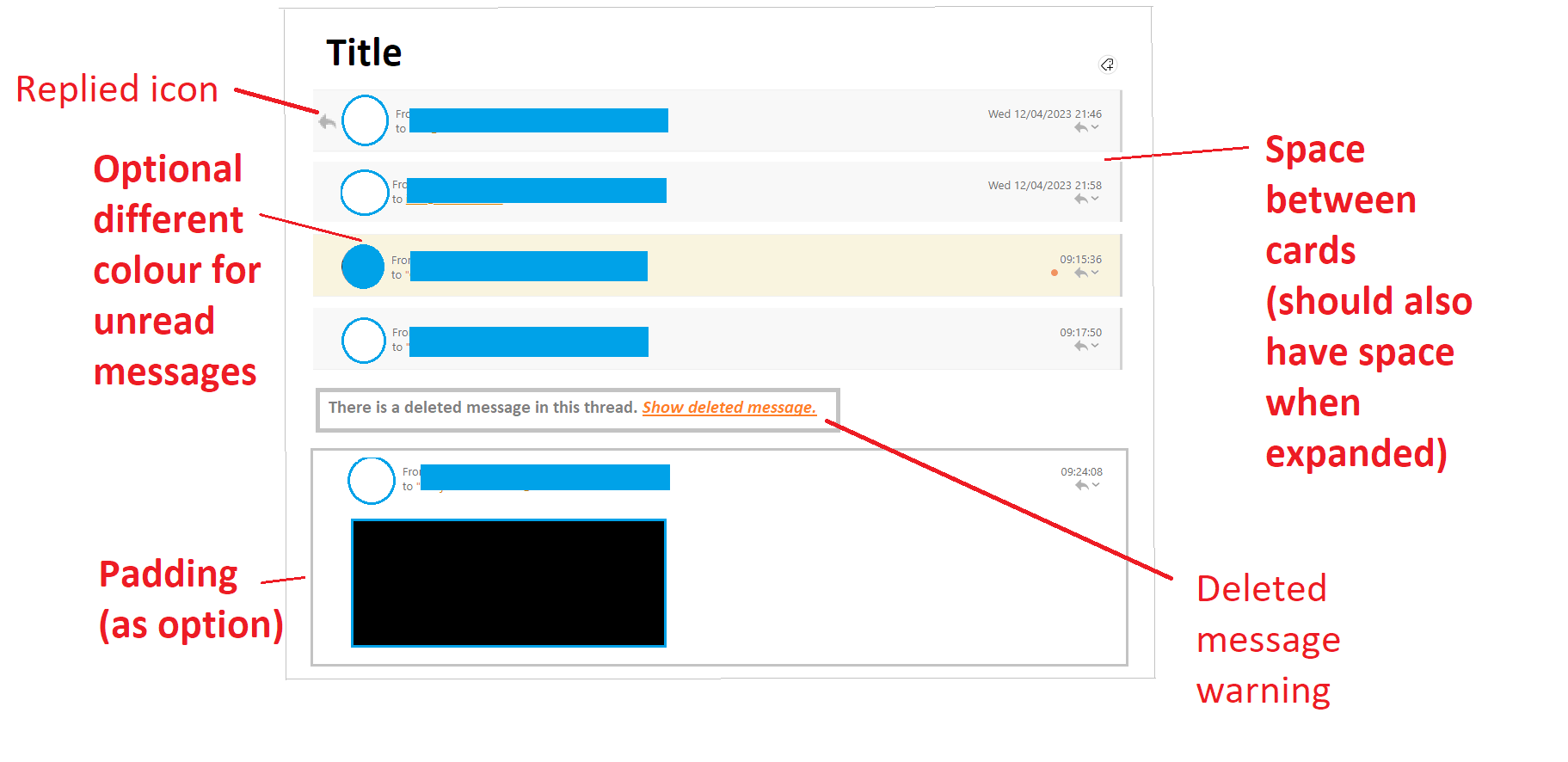
- It would be really useful to get space that can be coloured by the theme settings between each message. So the messages display like individual cards. Right now, all the messages run together with a thin line between them, so visually they don’t seem very separated. A thin space that can be set to a different colour would be really useful.
(On that note, it would be great in general to get padding options around e-mails, so we can set the spacing between the messages pane and the reading pane, and preferable colour it.) Right now there is not enough white space for me personally, and I would also prefer to be able to set it to a different colour, so the individual e-mails stand out more.)
-
An option to not scroll to the bottom of the conversation when you open it to read. Right now, you are reliant on seeing the “show older emails” icon to visually pick up on the fact there are other e-mails. It would be great if you could have it open with some of those previous e-mails already showing.
-
An option to include deleted e-mails would really help. Sometimes you delete an e-mail, but get a new one as part of the same thread. Other programs and Gmail make this obvious by putting a note that there was another message, but it was deleted. Some even let you display the deleted message. This can be really useful if you, for example, want to save storage as you go by deleting unnecessary e-mails, but another e-mail comes back and you need to see the deleted one for reference.
-
In Reading pane and and List pane (but particularly in the Reading pane), it would be useful if unread messages could be set to have a different background/header colour than read messages. Right now, the small circle indicator is not enough to flag there is an unread message in the conversation (especially if it is higher up in the conversation), whereas being able to change the background colour of the unread message would really make it stand out.
-
An icon for where you have replied to messages.
I have put an example of these with collapsed messages, but it would be good to have these with expanded messages too.