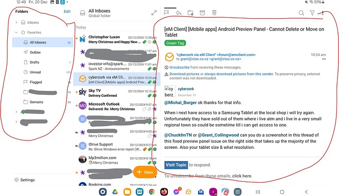
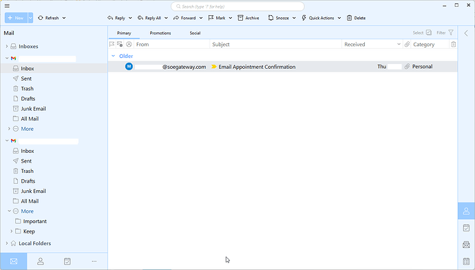
Recent transfer from Postbox with paid version of desktop. Mac desktop app seems to work okay. Have run into an issue with the Android version, however. On a tablet (Samsung Tab), there is a fixed preview panel on the right side that takes up the majority of the screen. Cannot move it to the bottom or delete it (so just the list of emails can be seen). The desktop version allows this under Appearance > Layout. No such option exists in the Android version on eM Client (that I can find). Nor can you set a flag to not deem an email opened if it is in the preview panel. I set it to “disabled” just to stop the behavior. I’ll watch what you guys do with the Android version, but for now the tablet/phone App for Gmail has an advantage. As an aside, on a very small screen – like an Samsung FE – the side panel does not appear – only the list. Go figure.
+1
I am also frustrated by this. I have the emclient Android App on my phone and my tablet. It works fine on the phone, but on the tablet, the preview is fixed, and literally occupies the entire right hand half of the screen, leaving the folder list and the email list squashed up on the left. Neither can be changed. There is what looks like a zoom arrow pair at the top right of the email list, but when you hit that it zooms the email not the list.
Would really like a small enhancement to turn off preview, or change the recognised screen size so it can be used like on my Android phone.
Yes I’ve also seen that preview problem with the Droid version on tablets. I suspect it’s not been designed for tablet use and only mobile atm.
Needs Devs looking at a Tablet Droid version.
Of course we’ve spent a lot of time to support tablet for factor as well with thje mobile app. Basically we set the layout based on the tablet size. For very small tablets we only show one box (message list or message detail), for bigger ones we show two of them and for large tablet screens we also show folder list by default. Can you share a screenshot and tablet size where you experience that behavior? Currently we don’t plan “Message list on the bottom” layout type for mobile application.
@Michal_Burger ok thanks for that info.
When i next have access to a Samsung Tablet at the local shop i will try again. Unfortunately they have sold out of them where i live atm and i live in a very small regional town so could be sometime till i can get access to one.
@ChuckfmTN or @Grant_Collingwood can you do a screenshot in this thread of this fixed preview panel issue on the right side that takes up the majority of the screen. Also your tablet size & what resolution.
Attached screenshot here. I have circled the two fixed areas, the folders on the left, and the message on the right. These two use up 75% of the display, leaving a very small list view, which is the most important.
My table is A9 Plus with 11" screen.
Also of note, on my phone, a Samsung S10+, it shows the List and from there you can open folders or the message, which is much more suitable, and the screen is smaller.
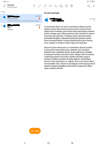
I understand that you do this via detecting tablet screen size. However, with large screen tablets like mine, which has a 14" screen, the Android app detects it as if it should display the 2-panel even in the vertical position.
This creates an enormous waste of space. Please, would it be possible to just let us choose the layout, or if not, make sure that the app does not display this preview panel when tablets are on the vertical orientation?
Thanks!
The new BETA includes number of improvements for Tablet UI, including options to expand/collapse the message and folder list based on your own preference.
Hmmm, I am a beta tester, currently on version 10.3.1746 from April 26, 2025. There appears to be no other version for me to update further.
On this version, using the app on my 14" tablet on the vertical position, the only button I have is the one that maximizes/restored the email from/to the right preview panel. There is no option to remove the right preview panel (therefore achieving the same behavior we have on cellphones, where everything happens on one panel).
I see, I apologize for misunderstanding, in that case please report the details to [email protected] so we can add more improvements to the tables UI options in future updates.
Can you please show a screenshot so we have a better idea of your layout?
Sounds like what you want is and option for “no message preview” at all in Portrait view, so you then just see the subjects in a list all the way does the page where you then press the subject to open them like the eM Client Droid Phone app when in Portrait view. Yes I also would like that view.
Be good to also have subject list view option “without a preview” in Landscape mode as well on tablets like mobiles.
@Michal_Burger Sure thing. Here you can see how the app is being displayed in my 14 inches tablet when used vertically. The app clearly is assuming that the screen is large enough for 2 panels, because it is a large screen, but still in vertical orientation this wastes as lot of space.
What I would like is to have no preview panel to the right. That is, I would like it to have the same layout it has on cellphones, when using a large tablet vertically.
Hope this helps, but don’t hesitate to let me know if there are further details I could provide.
So your complaint is not too little space for the email detail (you can set it up like that via this button)
![]()
but too little space for the message list, right?
@Michal_Burger More or less. I know that button maximizes the email reading panel. But I would not want a similar button for the email list. That would force us to give several extra clicks to alternate between email list and email reading.
My complain is that I just wanted to use the exact same 1 panel layout that is displayed by the app on cellphones (and, I think, on small tablets).
Which is also, for example , how the Gmail app and the Outlook app work on any tablet in the vertical position. That is, only the email list is shown. When we click on an email, it opens in full screen (equivalent to pressing that button you mentioned). When we go back, again only the email list is shown.


