As I’m settling into using eM Client, I’ve started experimenting a little to find what works best for me. I’ve been trying different themes from users (Themes | Custom Themes from Our Users | eM Client) and testing different layouts.
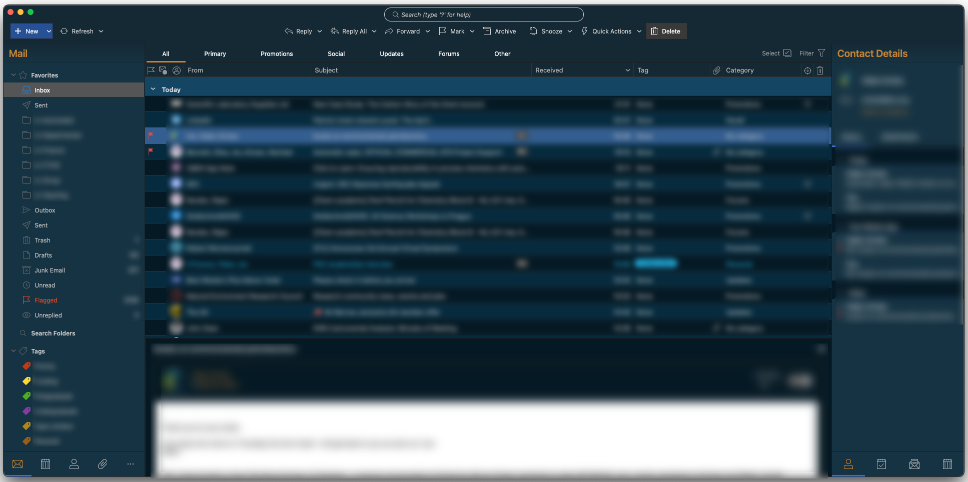
I had a moment of nostalgia, thinking about when I used to use Eudora for many years, and I noticed Thunderbird could use a similar layout. I went back into eM Client and was very happy when I found I could do the same sort of thing with View → Layout → Messages on the Bottom.
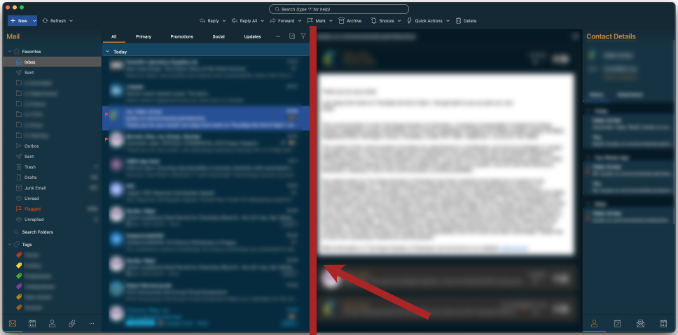
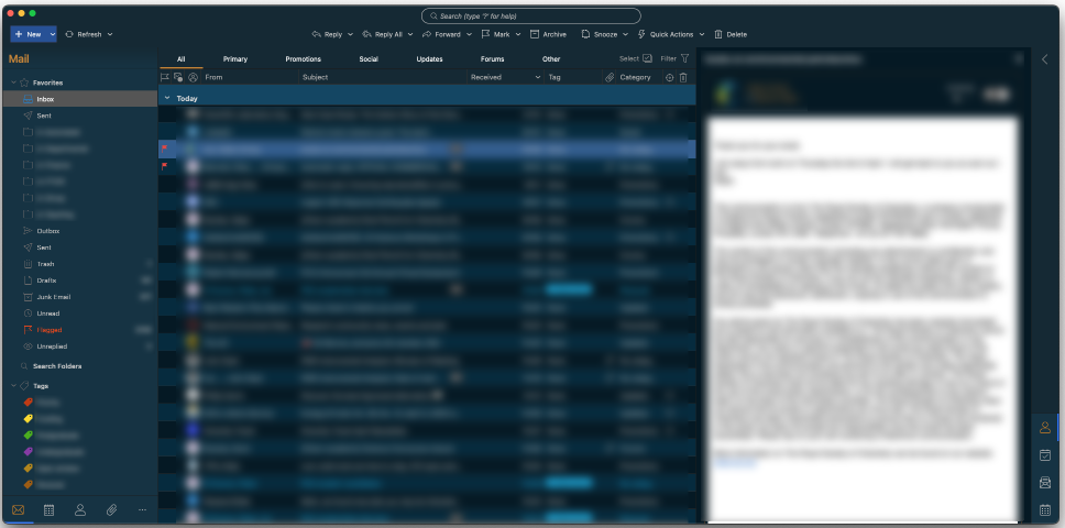
Then I dragged the divider between the list and the message towards the right to see how much I could squeeze in on the left side and then… POP! … I now had the detailed column listing on the left and the message panel on the right! Elements of both worlds.
This might be something everyone else already knows and I’m just “late to the party.”
I know the eM Client team are used to fielding questions and problems on here (and there will always be bugs with any software, no matter how much it has matured), but I also wanted to add a big thank you for their efforts. I keep finding useful little things as I become more familiar with the software!
I realized I might need to clarify this. My post was not simply about an ability to just move the divider and change the width of the message list!
It was that the fundamental layout changes when doing so (the format “pops” between layouts when moving the divider enough in either direction), now having discreet columns for flags, read/unread status, avatar, From, Subject, attachments, Tags, Categories, and more. As one consequence, this should make things easier to sort, which is a subject which has come up in other threads.
I’d previously thought I Iiked the Eudora-like discreet column format, but didn’t like messages being at the bottom, which came with this layout option in the eM Client menus. I preferred seeing the message body on the right. So now this approach offers the best of both worlds.
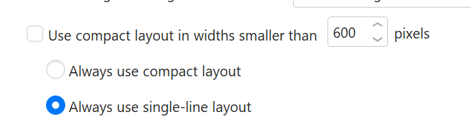
Another tip - if you want the message list thinner but still use the “single-line” layout instead of the “compact” one, you can set to “Always use single-line layout” at the bottom of the Menu>Settings>Mail>Read section
The default is to switch between them based on available width (which you can also customize) but it can be turned off if you prefer one layout over the other at all times.
That makes sense. So the switch with the moving of the dividing line is related to the number of pixels, if ticked, and the Eudora-like column format is referred to here as the “single line layout,” while the default layout is the “compact layout” (avatar, lines of preview text, etc.).