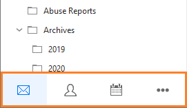
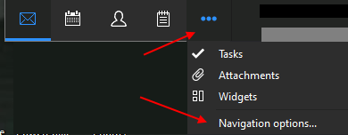
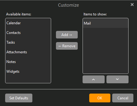
Click the three (dots) at the end of Navigation panel. Then remove all other items except mail.
You then end up with (only mail) icon showing and everything else is hidden.
If you then say hid the whole panel in eg: Settings instead of just disabling buttons via Navigation Options, how would users then quickly change / switch to the Calendar, Tasks, Notes etc ?
Still need to then be a (visual quick way) for users to navigate between the various sections if you are going to disable that entire panel. I personally like that quick easy access panel down on the left.
In the past, if you removed all the icons from the setting that @cyberzork gave, the whole panel would be removed. But then there was no way for the user to ever get it back without deleting their database and starting over.
Understandably not a desired outcome if the user mistakenly deleted the icons.
So we disabled that.
If the one or two lines it takes up are an issue there are some alternatives:
The More folder allows you to hide unwanted folders, and thus free up real estate so other folders can be seen.
You can change the row height to display more rows in the same space. You will find that in Menu > Settings > Appearance > Lists > Row Dimensions. If you reduce it by even 1 pixel, that should compensate for the space the panel takes without compressing the rows too much.
Why isn’t it just possible to hide/unhide this field via a simple checkbox? The sidebar has this option, I was surprised not to find it for the navigation buttons (and find it a little strange, too).
Changing row dimensions isn’t really the answer, you can only cramp so much information into so much space without feeling uncomfortable. At the end of the day, it’ll always remain wasted screen real estate for those who don’t need it, and I thought this is what eM Client was all about - to give users the tools to customize exactly to their needs?