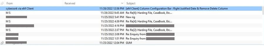
EM Client does not allow for Left Justification of the Received Date/Time field. However, they Left-Justify EVERYTHING else except this. Which FORCES you to put it all the way to the right or put something like the Attachment field just to the right of it so there is some spacing.
I’ve tried to talk with an EM Rep, but for some reason the discussion just goes round and round, I don’t feel he is hearing what I’m saying at all. Why not let customers decide what works best for them.
SO, which do you prefer… R or L justified? Also, do you think R/L Justification for column settings should be an added option for users to decide on their own.
Maybe where you place the Received Time/Date field, but not for me. What about the examples posted specifically? You really think Right Aligned is easier to read?
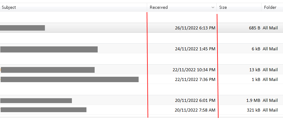
I agree with @Brian31 right aligned for the received date and time is easier to read / see in my view, as its “not as cramped”. Same goes for the “Size” column as it’s much better aligned to the right.
eg: The problem for me with left aligning the Date and Time is sometimes the Subjects are very long to the right and if the date and time was left aligned it would make it harder to read at a glance than if it was right aligned. So i think its better to keep it right aligned by default.
However yes @Greg_Alexander would be good as a (feature request) in Settings for users such as yourself and others who would prefer to have the Received Date and Time aligned left as an option. So would all depend on how many other peeps would want the date and time aligned left.
But in your example you have white space after the Received column, so yes… easy to read for you. But dang near any other selection has the date/time running right up next to it. For what you’ve displayed, perhaps Right aligned isn’t so bad, perhaps even better, but my example shows the reverse.
My largest ‘issue’ is that administrators seem dead-set against giving an option… PERIOD. I just don’t understand that mentality.